| Map |
Topics |
Book |
|
|
Reverse Engineering
- First: Self assessment sheet
- Main topic: If this web page was the result, what were the Requirements?
|
--
|
|
|
Introduction to HCI
The Challenge: what is HCI, why is it useful, and why study it?
- Class business -- books, ..., minor forms, ...
- Web pages
- Class mailing list
- First class experience...lessons learned?
- Projects and class provide experiences as well as facts
- Project 1
- KISS, for all projects
-
the map
of the course
- Reminder: Show the video!
(For each video) What are the lessons learned?
- Some possible approaches to an HCI course:
-
a theoretical approach that focuses on long lasting concepts that
can be used regardless of domain, implementation and platform.
-
an approach stressing psychology and human mental/physical abilities.
- a software engineering view that focuses on interface building
and the integration with existing software systems.
- a platform centered view that addresses mobile, tablet, screen.
- an application centered view that addresses games,
instruction, robotics, etc.
- an information architecture point of view that stresses paths
through information and how the interface can support that.
- a specific (as opposed to general) view that focuses on one
device and one interface for a particular application.
- an inventive approach that creates funky, novel interface
devices and studies them.
- Choice of material - mostly type "a" with bits of "b" etc.
- Motivation (slide)
- Broad, basic and general
e.g., no mobile, no dynamic, no special devices
- A lot of focus on evaluation -- ???
Course goals/outcomes -- what you'll see/do/learn
- Small design decisions have
major effects on users
- Technology isn't the primary
concern
- Sensitivity to HCI issues is
key
- Evaluation is 'future proof'
- You need to confirm the "obvious"
- What's HCI?
- HCI has contributions from many areas
- CS Systems, Psychology, Art, AI, Ergonomics, Linguistics,
Design, Engineering, Sociology, Philosophy, etc.
- "It's Obvious!"
- Really? needs knowledge, trade-offs, experiments.
- It is more than the
sum of the parts
- It's about "Design" -- algorithms + software eng + interfaces
- Design factors -- incl. user, task, hardware, interaction, ...
- Goals for a good User Experience (UX)
- Goals for Usability
- list
- They must be measurable! (i.e., metrics)
- How are these goals related?
- Normal people vs CS Majors
- Extensive computer knowledge/experience
leads to different abilities and expectations
- We're not normal!
- The moral:
design for the users and their task, not yourself
|
--
|
|
|
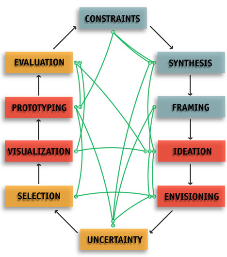
Models of Design
The Challenge: what is design and what does it have to do with HCI?
- HCI is mostly concerned with the Design of interfaces.
- Aspects of Design
- Cycle:
- Prototyping
- Evaluation
- Refinement
- Identify Needs, Establish Requirements (with User & Task Analysis)
- Developing Alternative Designs (Conceptual, Physical)
- Build Interactive Versions of Designs
- Paper Prototype; Rough Computer Prototype;
Detailed Computer Prototype
- vary by
- Materials - e.g., paper, computer, special device.
- Resolution - e.g., simplified sketch, screens, final product.
- Scope - e.g., single feature, feature subset, full set.
- e.g.,
Paper prototyping
- e.g., Moqups+ for "wireframes"
- Advantages of Low Fidelity Prototyping+
- Detect & fix major problems early
- Build cheaply and easily
- Get feedback on high-level concepts
- Iterate more willingly:
- change is easy early, difficult late
- Prototypes are portable
- Evaluate (Metrics, Questionnaires, Interviews, Heuristic
Evaluation, etc.)
- Cycle:
Decide, evaluate, decide, evaluate, decide, evaluate, ...
- Design Ingredients:
needs, requirements, constraints, preferences, evaluation
criteria.
- Multidimensional search in a Search Space.
- Generate many alternative conceptual designs, then evaluate and select.
- Least commitment
- Make Evaluation Criteria explicit & measurable, with importance.
- Concept scoring matrix
- Understand uncertainty of evaluation
- Design Thinking
- Design models: waterfall, spiral,
star, ...
|
Models: Figs 1.8, 1.9, 1.10;
Conceptual design: ch8.
|
|
|
HCI tasks & Metrics
The Challenge: how do you measure the effect of HCI activity?
-
What are the activities of HCI professionals?
- Theories, Principles & models
(i.e., what people do in different situations & why; how they
process information; best practices; ...)
(e.g., Universal Principles of Design)
- Guidelines for interface design
- Gathering, Analysis & Evaluation of empirical data
-- design & carry out experiments
* gather data
* i.e., a design choice produces what effects?
-- data analysis to find patterns/features
* form hypotheses by induction (using data)
* confirm a given hypothesis
-- evaluation to determine quality
* e.g., evaluation by usability testing
- Invent/Design/Use Software-based methods
-- menus, forms, commands, windows, messages, ...
-- use of sound, graphics, animation, speech, ...
-- interaction techniques (e.g., button push, gesture, force)
- Invent/Design/Use Hardware-based methods
-- keyboards, displays, other devices
-- e.g., eye tracking; brain waves; "mole"; ...
- Design elements: icons, layouts, color schemes
--
e.g., meet
an icon designer+
- Tutorials, manuals, demonstrations
- Questionaires (e.g., determine user's satisfaction)
- Growth of number of devices with interfaces (examples???)
--
makes HCI more important.+
-- responsive
design+: sharing an interface across devices
(issues??? -- e.g., thumbs; space; progressive disclosure)
- Remember, HCI is about Human Performance
- Poor interfaces cause...???
- General goals for interface development
-- remember: good usability and good user experience
-- be nice to users: e.g., avoid & respond to potential errors
-- deliver functionality! (for effectiveness)
-- discover by task analysis
e.g., task objects & task actions
e.g., action frequencies;
subtasks
-- others
(e.g., portability, standardization, reliability, consistency, ...)
-- still more+
goals make it very hard!
-- trade-offs have effects: e.g, consistency versus...???
- What's the problem with the phrase
"easy to use" ???
-- we need to measure the effect of HCI activity!
- Remember, for each interface:
--Needs, Requirements, Constraints, Preferences and
Evaluation Criteria
- The basic Metrics (for evaluation):
- Speed of performance
- Rate of errors by user
- Time to learn
- Retention over time
- Subjective Satisfaction
- Other metrics??
|
Ch.2
Metrics: Ch.6, 21
Table 3.1
|
|
Map
|
Human diversity
The Challenge: how does human diversity affect interfaces?
- What is Human diversity?
- Can we dilute the effects of diversity?
- Reduce diversity
- e.g., training
- Reduce demands on user
- e.g., less information displayed;
meet expectations
-- don't push on boundaries of ability
- Reduce sensitivity
- e.g., make interface more tolerant to
user input variation
- e.g., DWIM
- Increase adjustability
- e.g., customization
- Offer variety
- e.g., versions for experts, and novices; languages/culture
- The moral:
Design workspace & interface to compensate for user needs due to
diversity (And due to environment & task)
e.g., A
space with a heavy emphasis on flexibility, mobility and connectivity+
- Consider the whole "system":
ENVIRONMENT-->USER-->INTERFACE-->SYSTEM
-
Environmental factors affect people's interface use
-- what effects do each factor have? (on people and interface)
- Dirt (e.g., Norton abrasives)
- Noise levels (and vibration) (is communication needed?)
- Environment Background Illumination levels (dark to bright)
- Illumination on/of display (glare & flicker on/of display)
- Air quality & movement
- Temperature & humidity
- Electromagnetic pollution
- Space -- Can you move well? Do you need to? Sight lines?
- Safety of environment. Examples???
- Environmental distractions (attention)
- Interruption (e.g., loud noises, flashes, smells, alarms) Effect???
- Conclusion: Environmental factors need to affect interface design choices
- USER-->INTERFACE-->SYSTEM
-
User Differences ("know the user"!)
- User Analysis
- How/why do different people react to the interface and environment?
- Diversity: what differences between people are important?
- What if the user were...
Chinese, left handed, short sighted, 92, very tall, an
artist?
- Possible Gender preferences/differences:
See Gender
HCI+
and an
example+ from VR.
- Abilities: e.g., perceptual, memory, cognitive, motor, physical,...
- Human Mental & Physical abilities map to design requirements & constraints!
--- N.B., lack of abilities correspond to constraints
- Physical factors: e.g., size & reach
- importance? keyboard, screen, other devices...
- why not design for average person???
-- so how do you handle that???
- static measurements not enough, Why???
-- e.g., speed, force, accuracy of mvt., endurance, reaction.
- ergonomics -- work surfaces, chairs, controls, ...
- interaction of IMGD & Robotics with these issues???
- Social factors
- Social Interruption
- Privacy
- Collaboration
- Social interaction vs. isolation
- Personal space
- Trade-offs???
|
Ch.3, Ch.4, Table 4.4
|
|
|
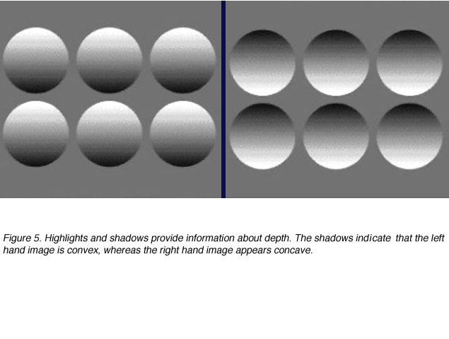
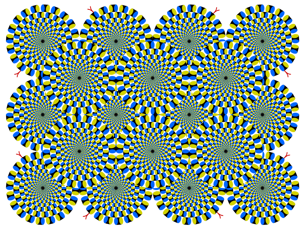
Abilities: Perception, Memory, Cognition
The Challenge: do human abilities affect interfaces?
- More about "Abilities"...
- Perception & Cognition ("know the user")
- Reaction time
-- simple reaction;
-- hands faster than feet;
-- choice reaction;
-- depends on
stimulus-response compatibility.
- Visual system
- Touch -- why relevant???
- Hearing -- range of frequencies -- why relevant???
- Spatial Reasoning ability -
cube folding
- Factors affecting perception & cognition
-- emotional arousal (fear/stress vs. errors);
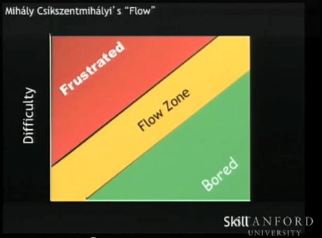
-- "flow" -
Difficulty/Skill zones (frustration, flow, bored)
-- cognitive load / mental effort (read while counting backwards);
-- attention.
- grabbing attention leads to engaging UI
- colors, fonts, sounds can capture attention
- novelty/differences enhances attention
- reduce distractions
- never make user multi-task!
- remember cone of visual attention
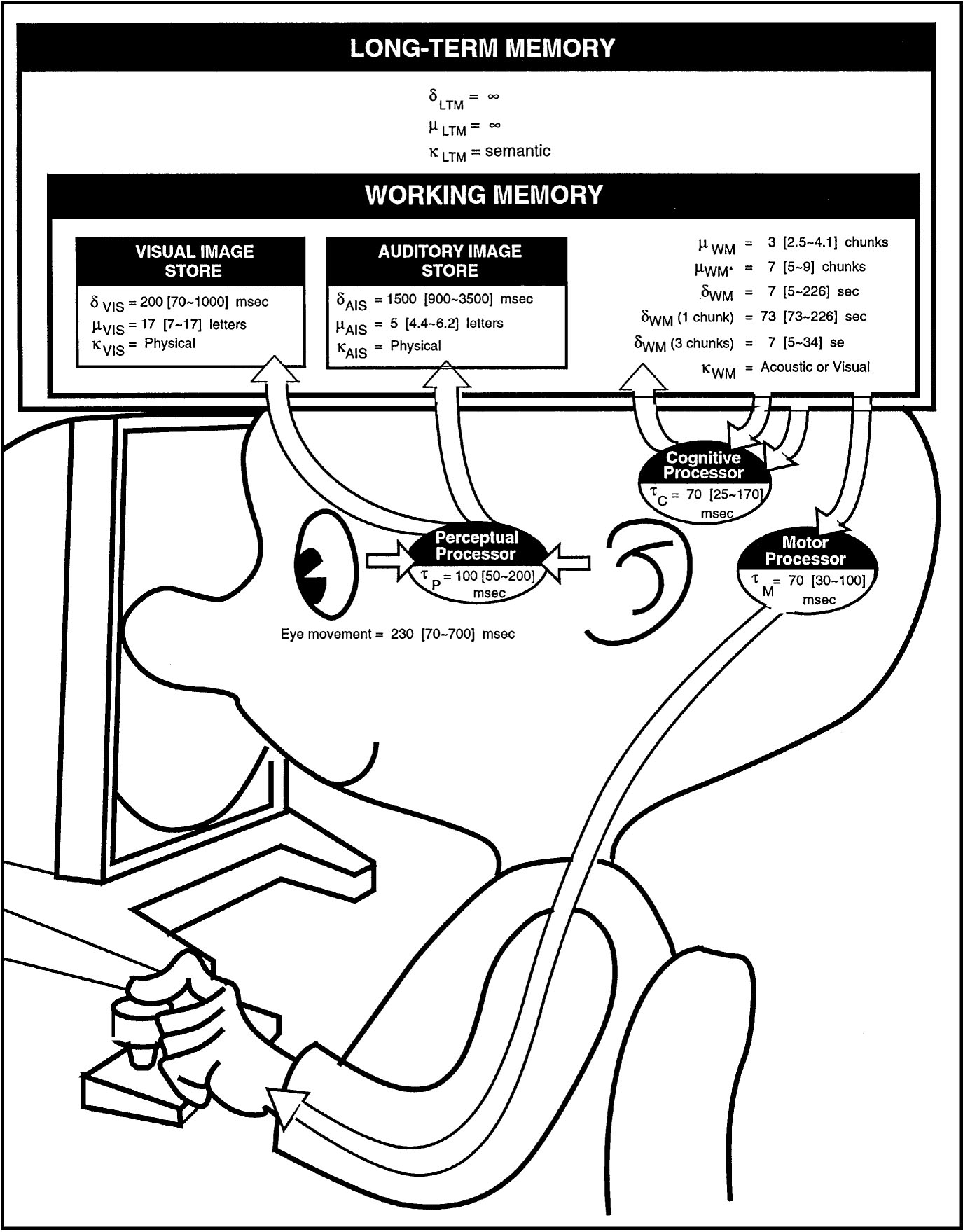
- Model Human Processor
(STM, LTM, Chunking, Processors)
- types of memory (VIS, AIS, STM/WM, LTM)
- STM: chunking, decay time & 5-9 chunk capacity.
--- a better estimate is 3-4 capacity.
--- i.e., don't make people have to remember things.
- Perceptual Processor -- cycle time
-- role in perception of movement (e.g., film)
- Cognitive Processor -- recognize-act cycle.
- Motor Processor -- discrete control of movement.
|
Ch.3
|
|
|
Perception, Memory, Cognition (continued)
The Challenge: can we use any laws in interface design?
- Principles of Operation (handout)
-
Fitts Law
-- predicts time to move hand
-- quick, directed movements
-- sensitive to distance moved and target size
-- "bit" = amount of information (reduces uncertainty)
-- imagine moving accurately through a path/trajectory.
- Power Law of Practice
-- "learning curve"
-- predicts time to do task
-- practice improves performance
-- has lower bound.
- Hicks Law -
(details) -
(possible
use)
-- choice reaction (not really menu selection)
-- time increases with uncertainty
-- assumes equally probable alternatives
-- consider the buttons under lights example
-- reduce choice.
- Rationality Principle
-- rational action is the best one given current knowledge
-- influenced by
Goals, Task, Operators, Inputs,
Knowledge, Process-limits.
- Problem Space Principle
-- "design space" is an example.
Personality & culture
The Challenge: how does personality and culture affect interfaces?
- Human Diversity -- personality & cultural ("know the user")
- Personality types
- People don't want to work/think more than they have to ("the")(WPI)
- Cultural (linguistic, icons, formats, formality, ...)
- Cultural
dimensions and global Web user-interface design +
- Linguistic
-- alphabets, words, syntax (verb position)
-- Yummy! Pocari Sweat
-- reading/writing direction
impact of L-to-R & Top-to-Btm ????
- Icons (covered later)
- Standard formats
-- US vs. UK date (24th September 1987)
-- order of items in an address
-- names (e.g., Li Xiang and Brown David)
- Formality & respect
Other User Issues
|
Ch.3, 9
App.3
|
|
Map
|
T/P/G/M intro. & User Models
The Challenge: can making models help interface design?
- Theory, Principles, Guidelines, Models
- What's a Theory?
- an organized, well tested system of accepted knowledge
that applies in a variety of circumstances
to explain or predict a specific set of phenomena.
- what are the key words in that definition???
- why is a theory useful???
- What's a Principle?
- A basic generalization that is accepted as true and that can
be used as a basis for reasoning or conduct.
- e.g., "Relationships and patterns between variables can be
detected easily by allowing comparisons."
- Design Principles
- User
Interaction Design Principles+
- why are Principles useful???
- What's a Guideline?
- A rule that provides guidance to appropriate
behaviour.
- A rule of thumb, i.e., usually helpful
- The essence of experience
- e.g., "Respect the
rules of human conversation"+
- Sample Guidelines
- Note that 'style guidelines' are usually stronger.
- why are guidelines useful???
- What's a Model?
- A hypothetical description of a complex entity or process.
- Often describes structure, behavior and/or function
- e.g., Four level model (below)
- Have we seen one recently?
- why are models useful???
- Some models:
- Taxonomies
-- the simplest model
-- provides types/classes, ordering & grouping
-- e.g., types of user
-- why is it useful???
-
Four level model
-- conceptual, semantic, syntactic, lexical
-- useful for design or evaluation
- Conceptual level -- designer's (intended) model of system.
- Semantic level -- meanings (e.g., of I/O, of icons, ...)
- Syntactic level -- structure (e.g., of items on screen)
(maybe over time; I/O sequences)
- Lexical level -- primitive ingredients (e.g., icons,
windows, prompts, actions, ...)
- Connection between Designer's Conceptual Model &
User's Mental Model
(slide).
- What the designer wants the user to think about how the
system works, versus what users
actually do think about how the system works!
- User Expectations are important
- How well user's mental model matches and predicts the
action of a system affects Usability!
-
Mental
Models and User Experience+
- Guidelines for Designing
Conceptual Models
- Metaphors might help user understand the Designer's Conceptual
Model.
- User's Mental model
-- based on beliefs
-- incomplete, hard to run, unstable, no firm
boundaries, etc.
-- can be structural model (how it works)
-- can be functional model (how to use it)
-- allows user to try to predict & interpret system
action.
-- nice article about
Users' Mental Models
- Sample user's mental model -- changing text size in browser (mouse wheel).
- Sample user's mental model -- scrolling text in a window.
- Model 1 - scroll bar indicating direction of text movement.
- Model 2 - scroll bar indicating direction of window's movement.
- Mental models can dramatically change expectations
|
Ch.5, 4, 9
|
|
|
GOMS, keystroke model; Seven stages
The Challenge: how can I predict user performance?
|
Ch.10
|
|
|
Feedback; Consistency; Syntactic & Semantic Knowledge
The Challenge: how do I consider what the user knows and expects?
- Feedback (Principle)
- vital!
- small scale & large scale
- examples ???
- role of expectations
- if no feedback or delayed ???
- what if delay is variable?
- when is user willing to wait?
- within expected time period?
-- 2 seconds in human conversation
-- 0.1,
1, 10 seconds
- need feedback during long delays (e.g.??)
- related to Norman's 7 stages of user action ???
- Consistency (Principle)
- e.g., of naming, order, action, icons, ...
- Use of a grammar (rules) for syntax
- consequence: affects user's expectations
-- why important ???
-- connection with locus of control ???
- consequence: could learn from a single example
-- why important ???
- consequence: leads to few rules
-- why important ???
-- easier to learn ???
- Examples for naming, order, action, icons ???
- The
case against user interface consistency+
- Modelling User's Knowledge
- Four level model again
-- conceptual, semantic, syntactic, lexical
- Before, we were modeling the interface
- It can also be a model of
what the user needs to know
- There's an impact on user learning
- Syntactic knowledge
-- structure: order, layout, grouping, symmetry
-- low level details
-- many details
-- hard to learn & easy to forget
-- tend to learn by rote
-- small variations lead to problems
--- S = Save or Send ?
--- 'To From' or 'From To' order ?
-- Guideline: try to avoid/reduce/hide syntax!
- Semantic knowledge
- Use Analogy and Example to teach
- Users learn visually and by doing
-
Computer Concepts & Task Concepts
-- each has
Actions & Objects
-- i.e., four categories (CC.A, CC.O, TC.A, TC.O)
- These concepts introduced by designer's conceptual model:
-- Learned by user from the interface.
- These concepts form "expectations"
- Computer concepts ??? (actions & objects)
-- "normal" people may have trouble with them.
-- if visible then should match task concepts well.
- Task concepts ??? (actions & objects)
-- "normal" (task oriented) people should know them.
- Impact of strong vs. weak knowledge
and task vs. computer semantic knowledge
-- what kind of person?
-- what do they need to help them perform well?
|
Ch.4, 9
|
|
Map
|
User analysis, Task analysis
The Challenge: what do I need to know about the user and their task?
- "Know the User" --
User Analysis (UA)
- User Profile Checklist
-- plus other items if appropriate (e.g., IQ, RT)
- Personas
+ : a description of the attitudes,
characteristics, and knowledge of a fictitious person, used
to guide/evaluate the interface design.
- Novice
-- how to define???
-- how to recognize???
-- what do they know???
-- what do they need???
- Intermittent
-- how to define???
-- how to recognize???
-- what do they know???
-- what do they need???
- Expert
-- how to define???
-- how to recognize???
-- what do they know???
-- what do they need???
- Accelerators (for Experts)
- Macros
- Abbreviations
- Shortcuts through information (such as menus)
- Denser presentation of information
- Customization (how, when????)
-- helps put the user in control (locus of control)
- "Know the Task" --
Task Analysis (TA)
- Tasks & subtasks
- Task action grouping
- Task action sequences
- why do we care ???
- May be able to produce a Task Flow diagram
- Task frequencies
- List Task Actions & Task Objects
- Appropriate level for atomic user actions?
- Match user actions to task actions
- Output of TA
- Objects/artifacts used
- Use cases that describe user's work
"A scenario is an idealised but detailed description of a
specific instance of human-computer interaction"
- Results from "cognitive walkthrough"
-- evaluators do tasks
-- relates to human action cycle
(e.g., is button visible; is feedback perceivable?)
-- take the user's perspective.
-- might use a low fidelity paper prototype
-- confirms designer's analysis of user's cognitive operations
- Note of any "work arounds" used
- All other task information (see above)
- "Know the Domain"
-- what does the user need to know about the domain?
-- how can the interface help?
- "Know the Environment"
-- how might the environment affect the use of the interface?
-- physical and social issues
-- how can the interface help?
- Start Design Process...
- Be guided by the model of the
Elements
of User Experience+
- Collect together Requirements (+ve) & Constraints (-ve) regarding:
- users
- task
- domain
- environment
- social/organizational setting
- usability
- Collect preferences
- Determine trade-offs
- Determine expected emotional impact on the user
--- what kind of user experience?
--- emotions are very affected by pictures (e.g., especially faces)
- Determine Evaluation criteria (e.g., metrics), and plan evaluation methods.
- Build Conceptual Model
-- e.g., a Content Diagram (see text)
-- remember Guidelines for Designing Conceptual Models
i.e., what kind of mental model do you want the user to
have?
-
Select Interaction Style
and relevant
Interaction
Design+ issues.
- Identify all other relevant
principles+,
guidelines, models and metrics.
- Make prototypes (low/high fidelity, partial/complete scope)
--- Beware
of Pitfalls when
Prototyping+
i.e.,
- should focus on learning about problem/users/etc.
- should diverge before converging.
- work in low fidelity first.
- evaluate, evaluate, evaluate.
- try different prototyping tools.
- Evaluate!
- Refine and repeat...
|
Ch.3, 4, 6, 11
|
|
Map
|
Interface Evaluation:
... Principles and Rules for Evaluation (but also Design)
The Challenge: how do I know whether my interface is any good?
- Check Principles+
from Psychological p.o.v.
- Psychological: Users see what they expect to see
-- especially when rushing/stressed/distracted
-- generate and reinforce expectations, by using:
- principle of Consistency
- principle of exploiting Prior Knowledge
-- use metaphors (e.g., calculator)
-- use task knowledge
- Psychological: Users can't easily focus on more than one activity at a time
-- but many have to: guide the user
- principle of Perceptual Organization (grouping)
- principle of Importance
-- prominence: position/size/color/fading/overlap...
- Psychological: It's easier to perceive a structured layout
- law of Proximity (relationships)
- law of Similarity (relationships)
- law of Closure (fill the gap)
-- there's another kind as well
- law of Continuity (lines of dots)
- law of Symmetry (suggests grouping)
-- men think asymmetry is worse than women do
- Figure-ground (cows, dogs & zebra)
- Psychological: It's easier to recognize than to recall
- principle of Recognition
-- don't make the user remember
- Check Principles+
from Design p.o.v.
- Design: principle of Simplicity
-- natural, simple subtasks, uncluttered (KISS)
---- N.B., everything on the screen provides information,
---- don't make user have to filter stuff out!
---- So you should...
- reduce amount of action/thought needed to do task
- disclose information "progressively"
- make it easy by showing an example (if possible)
- possible actions should be obvious ("affordances":
see below)
- provide features that the user really needs
- provide defaults
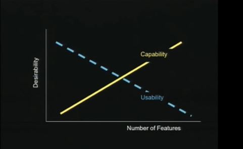
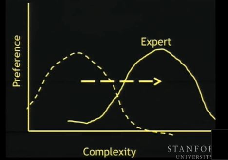
-- Note Preference/Complexity Curve
- Design: principle of Structure
-- grouping, layout (for Task)
-- the eye focuses on groups
-- things that are close together belong together
-- use color to add structure
- Design: principle of Consistency
-- uniformity, fewer rules, learnability, reuse of kn.
- Design: principle of Tolerance
-- i.e., a tolerant system
-- prevent errors
-- provide error recovery (undo, help)
-- possibly 'understand' errors and then guide user
- Check Principles+
for Experience
- Experience: principle of Visibility
-- can you see the possible controls to use?
-- can you see system status?
- Experience: principle of Affordance
-- what action does a control suggest?
- Experience: principle of Feedback
-- do you know that the control was used?
- Check Eight Golden Rules of Interface Design
- & Check Data Display Guidelines
- & Check Data Entry Guidelines
- Check
Ten general usability heuristics+
-- for Heuristic Evaluation
- The
Psychologist's View of UX Design+
|
Ch.5, 9
|
|
|
Usability metrics
... for Evaluation (and Design)
The Challenge: what should I measure?
|
Ch.6, 21
|
|
Map
|
Interaction Techniques: Menus intro
The Challenge: what's a good way to organize choices?
- Intro to Menus and Forms
-- for controls, info provision and data input.
-
Allows selection, reduces memory load, good for inexperienced
users, provides structure, relates to task.
- Design Issues:
intra-menu/form organization
inter-menu/form organization
- When Menus are
appropriate
- Textual or graphical.
-- EKG machine; ATM
- Semantic Organization:
- menus & their grouping must relate to user's task;
- must provide correct expectations
--- if don't?
(i.e., locus of control);
(i.e., mental map/model)
- comprehensive categories;
- distinctive categories.
- Mechanisms for movement within and between menus
(e.g., up, down, top, other) how???
- Various menu types: single, linear, hierarchy, network
- Will need menu aids for experts. Why???
- Consistency in all things!
e.g., Verb Noun menu items; menu layout.
- The Psychology of Menu Selection+
- Single Menus
- what is a single menu???
- Remember...
-- consistent format: such as???
-- show default
-- show previous selection
-- show what is not selectable
-- items organized by frequency??? changing???
-- reading direction biases???
- Pop-up: in response to pointing device, at cursor.
-- advantages??? disadvantages??? role of Fitts law???
- Pull-down: typically from menu bar.
-- advantages??? disadvantages???
-- remember "riffle" and "space saving"
-- can be extended to a menu of menus for hierarchy.
- Permanent: always available.
-- advantages??? disadvantages???
-- where to place it and why?
|
Ch.11, 16
|
|
|
Menus (continued)
- Single Menus (continued)
- Multiple items: single selection vs. multiple selections.
- Radio button & Check boxes as metaphor?
- How to set default (use previous selection?)
- How to indicate that nothing has been selected?
- How to show that you are finished?
- Pie Menu -
- Linear sequence
- set of items, actions or choices, all to be seen/done.
- e.g., parameter setting or feature selection
- task related order and grouping
- need to be able to reverse and/or undo
- provide summary at end before confirmation
- could use "multi-menu" instead (group)
- Tree structured (hierarchy)
- Best shape & why???
- Problems due to hierarchy??? (slides)
- Search Behavior in Hierarchical Menu Structures+
|
Ch.11
|
|
|
More Menu Stuff (continued)
- Organization of menu items
-- semantic, alpha, etc.
-- looking for a known item vs. looking for item matching
description
-- grouping & sequence (slides)
- Experts and menus
-- shortcuts, typeahead, direct access, menu macros.
-- In menu aids for experts: Mnemonic, letter shortcuts
(e.g., control+P = Print )
- Matching Items & Menu Titles
- Contents of a menu??? (consistent layout)
- Selection vs. Activation
- Designing Menu Systems
Fill-In Forms
The Challenge: what's a good way to control data entry?
- Fill-In Forms...
- self-explanatory
- require little memory
- effective use of screen space
- allows input of parameters with many values
- provides visible context
- allows revision and checking
- changes to form are visible (e.g., new field)(dynamic?)
...BUT...
- assumes knowledge of valid inputs
- assumes typing skill
- assumes knowledge of special keys
- can be inflexible, with system in control
- needs good error messages, error location, correction ability
- needs data persistance
- needs activation method when form is complete
- needs field to field transfer method
- needs editing within fields (computer knowledge)
- needs prestructured fields for special data (e.g. ???)
- needs list boxes for known data
- When Fill-In Forms are appropriate
- Fairmont
Hotels Case Study+
- Boingo &
BA Case Study+
- Guideline: Give the user something they want before asking them to
do something potentially unpleasant (such as form completion) and
they'll be more likely to do it well.
- General Guidelines include:
- caption placement
- handling frequent inputs
- using standard elements
- consistency -- internal, external
- avoid disorganization & crowding
- design to a grid
- avoid spatial tension (from proximity)
- use good figure/ground contrast
--- (The contrast rebellion)+
- group using layout
- whitespace is important (between AND within fields)
- Form Fillin Design Guidelines
- Designing Fill-In Forms (detailed!)+
|
Ch.11, 16
|
|
|
Command Languages
The Challenge: how can I give users more control?
- Command languages appropriate for...? (slide)
- Characteristics
-- immediate effect
-- user in control!
-- brief input
-- typing skill
-- puts load on user's memory (due to syntax)
-- for expert & frequent users (if not???)
- Language design goals (slide)
- Supporting user's task
- provide functionality
- enough power provided (can do task?)
- too much power?
-- slows learning
-- increases chance of error
-- more help & manuals req'd
-- 80-20
- need to do task analysis to determine commands needed
- transition diagrams used to describe effects of commands
- Command organization
- simple
-- one per task
- command+args
-- position vs. keyword
-- defaults assumed?
- command+options+args
-- difference between options and args?
-- extras add complexity
-- increases memory load
-- increase errors
-- command language macho! (slide)
- hierarchical
-- MOVE ROBOT FORWARDS
-- note "congruent" (insert/delete)
|
Ch.11
|
|
|
Commands (continued)
- Naming
-- be specific ("insert", not "add")
-- familiar terms & task terms
-- congruent terms
-- mnemonic (memory aid)
-- distinct (print vs. primp)
-- good abbreviations
- What to do with very high frequency commands ??
- Prompting (remind, command menu, dynamic)
- Completion
- Abbreviations
-- requirements???
-- good methods for production???
-
When does an abbreviation become a word?+
- Designing Command Languages
Command naming experiment
- Command naming: can we agree?
- maybe only 20% of the time
- try using most frequent choice
- allow customization
- but people often do poorly using their own abbreviations
- they're easy to create but hard to remember
|
--
|
|
|
Natural Language
The Challenge: it's natural, so why not use it?
- input vs. output; spoken vs. textual
- when appropriate???
-- text input
-- text output
-- spoken input
-- spoken output
- what's possible???
-- text input vs. text output
-- spoken input vs. spoken output
- strengths & weaknesses ???
-- natural
-- training needed ???
-- is a subset natural ???
-- good for commands and queries ???
-- ambiguity
- syntactic
- semantic
- pragmatic
-- I saw the girl in the park with the telescope
-- typing leads to errots
-- noise can lead to arrows
-- can train user with (NL) feedback
-- users make incorrect assumptions about system abilities
Direct manipulation
The Challenge: how do I get the user to be more engaged in their task?
- "Direct" & "Manipulation"
- e.g., putting trash in the trash can
- e.g., moving document to printer
- WIMP interfaces (Windows, Icons, Menus and Pointing device)
-- a particular combination of interaction techniques
-- WIMP may not be Direct Manipulation
- Direct
Manipulation+
- visible actions and visible objects
- manipulate directly
- emphasize task, minimize computer concepts
- minimize syntax (and typing)
- learning enhanced by action (learn by doing)
- natural cursor control (for task)
-- hands, eyes, fingers
-- eyetracking+
-- 3D gesture+
-- point and don't click???
- Metaphors (to suggest a similarity with a real thing/process)
- Affordances (principle)
- Reinforce conceptual model (affecting users mental model)
- Extreme Direct Manipulation:
BumpTop
desktop+
- Tangibles: Toy blocks
that "think"+
- why it works
- user in the task: tool vanishes
- representation of reality
- direct involvement
- physical/graphical representations can enhance p-s.
- visual representations encourage retention
- it has problems
- icons/diagrams may be confusing
- abstracted reality isn't real (especially behavior)
- e.g., users may infer incorrect properties
-- what's on real desk top?
-- what if I tilt the desk?
-- trash can has weight?
-- if trash can is full? can it be?
- text has higher density of information
- typing often faster
- best for few objects & actions
- bad match for looping/searching
|
Ch.10
|
|
|
- Direct Manip.: Impact of video games
- sophisticated sound & graphics
- challenging tasks (more "interesting")
- significant user base
- abstractions of reality (expectations)
- use of natural controls (special devices)
- immediate feedback (high involvement)
- learning by doing
- games vs. applications!
Icon Design
The Challenge: isn't it just a picture?
|
Ch.16
|
|
Map
|
Device evaluation
The Challenge: do we need to evaluate interaction devices too?
- Interaction Devices
Key question -- how do we know that they are any good?
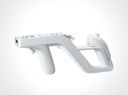

Note: 300 people evaluated the 2nd one in late 2013.
Any good for music?

[The Janko keyboard]
- What are the interaction devices ???
- How to Evaluate
-
what are the evaluation factors for comparison ????
-- in addition to basic metrics
- Role of Fitts' Law ???
- Pointing device tasks
-- how does each device do each task ????
- Select
- Position
- Orient
- Path
- Quantify
- Text manipulation
-- note affordances & feedback (e.g., for a mouse)
- Direct vs. Indirect
- direct
- touch screen, pen/stylus (on screen only)
- strengths & weaknesses ????
-- e.g., touch screen
--
e.g., beyond
the touch screen +
- indirect
- mouse, trackball, joystick, graphics tablet (off screen)
- strengths & weaknesses ????
-- e.g., mouse
- Note the complexity of the mapping
-- e.g., gas pedal to speed
-- e.g., mouse forwards to cursor up
-- e.g., mouse distance to cursor distance
- What type is keyboard? (strengths & weaknesses?)
-- arrow keys make keyboard a pointing device!
|
Ch.12
|
|
|
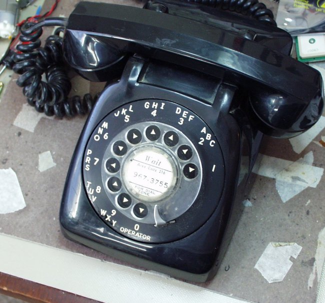
Keyboards
The Challenge: what can we learn from something so old as a keyboard?
- Consider a device we know a lot about
...what can we learn about device design issues from it?
-
What do we know: left handed typists???
- Keyboard history
- Why would you need to design/evaluate a keyboard ???
-- i.e., for what tasks?
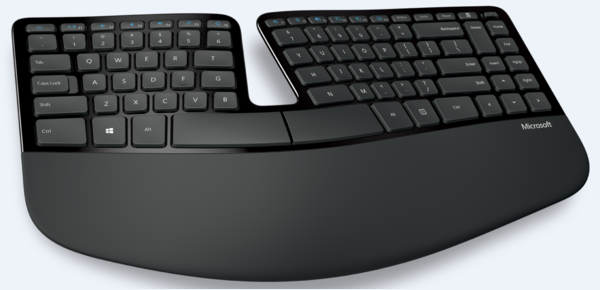
- Keyboard design
- types (chord, split, ...)
- how does user get feedback from keyboard???
- key & keyboard characteristics
-- e.g., dimensions & other parameters
- keyboard layouts
-- e.g., QWERTY, Dvorak, Alpha, ...
-- Typing effort
-- QWERTY
-- Dvorak
-- Colemak
- Variable layouts
- Keyboard
keys: an introduction
- Keyboard
variations+
- Ducky
Yellow keyboard+
- The
BeeRaider keyboard+
- TextBlade keyboard+
- Special
Apple Wheel Keyboard+
- Speeds
- User Analysis: fingers and hands
-- finger strength/dexterity
-- "rolling", alternating hands, less same finger mvt.
-- Dvorak: vowels together
- Task Analysis: frequencies
--
Letter, pair and word frequencies
-- Dvorak: consonants on right
- numeric keys
- Keyboard
nostalgia -- the return of the "ding"+
- Fn keys
- types
- cursor keys
- grouping/labelling
|
--
|
|
Map
|
Error messages
The Challenge: is there a right way to tell users that they're wrong?
- Errors due to
- lack of knowledge (what to do??)
- incorrect understanding (what to do??)
- inadvertent slips (what to do??)
- See also Rouse & Rouse 1983 -
Human
Error Classification Scheme
- Fatal
error, buddy. That input really sucked!+
- What type of users makes errors??
- Errors lead to feelings of ....??
- Does it vary by type of user??
- In what situations??
- How do you get the user's attention??
-- depends on severity/consequence??
-- what sense to use??
-- consequences of interruption??
- Anticipate & Prevent Errors
User's make lots of mistakes! (30%?)
- "The best error message is no error message" (i.e., prevention)
- Design strategies (for systems)
- Fail Safe -- safe shut down at system failure
- Monitoring -- detect early signs of error/failure
- Protection -- protect user from consequences of error/failure
- Warning -- about impending problems
- Interlocks -- make sure that conditions are right for action
- Things to do:
- Constructive error msgs
- Undo, Cancel
- Avoid "modes"
- Consistency
- Provide feedback
- Correct simple errors and involve the user
-- gently reinforce correct behavior with feedback
- Require confirmation. OK?
- Reduce typing
- Reduce ambiguity
- Reduce memory load
- Avoid distractions.
- Break complex error-prone tasks into small chunks
- Help with "standard forms" and conventions (e.g., date, SS#, US state)
- Reinforce Conceptual Model (to build stronger/better mental model)
- Make computers/people do what each does better! (examples???)
- Analyse error frequencies & distribution!
-- make adjustments to interface
-- make adjustments to training/help
- Do lots of user evaluation of the interface
- Error messages
- guidelines for error msgs
- clear, precise, soothing, helpful
-- i.e., what does the user need?
- specificity (what, where) (mark error)
- guidance (how to fix)
-- might need to describe the "rule" being violated
-- i.e., train the user
- tone (be positive, not alarmist)
- good language (based on TA&UA)
- user centered: user in control
-- e.g., avoid imperatives
-- e.g., variable verbosity
- format (not all caps)(indicate error msg type)
- placement (standard place)(near error)
- when to present errors (disturbing?)(after closure??)
(N.B. The memory release sense of "closure")
- quality control (guidelines/standards)(usability tests)
- avoid anthropomorphism (system isn't a person)
|
Ch.3, 9, 13, 16
|
|
|
Color
The Challenge: how do I make color count?
- Color
- intro: color examples and confusions (slides)
- uses for color
-- emphasis, warning, grouping, distinctions, attractiveness
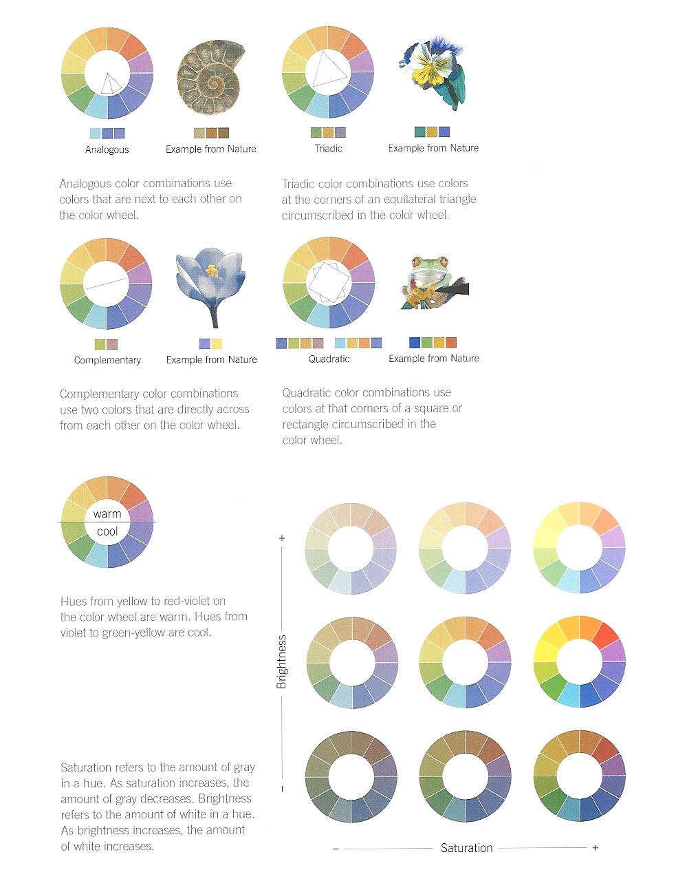
- color wheels
- color
schemes
-
color deficiency /
(blindness)
- about 1 in 12 men are fully or partly color blind
- about 1 in 200 women
- red
green
- blue
yellow
- Tests
- colorblind safe color selections
- Be aware of some Color pairs
-- Red and Blue
-- Red and Red?
-- Red and Green
-- Color in context
- Grouping methods -- line, white space,
color, shape
- Contrast for readability
- use [black] with light colors, and
[white] with dark
colors.
- color/color contrasts can be increased by adding
white to make a tint, or adding black to make a
shade.
- use of color --
***Guidelines***
- color meanings
e.g., Red for {heat, anger, power, danger, emotion, importance}
or other meanings
(Red)
- Asian Color Symbolism (cultural impact)
Red: Happiness, marriage, prosperity
Pink: Marriage
Yellow: Against evil, for the dead, geomantic blessings
Green: Eternity, family, harmony, health, peace, posterity
Blue: Self-cultivation, wealth
Purple: Wealth
White: Children, marriage,
mourning, peace, purity, ...
Gold: Strength, wealth
Gray: Helpful people, travel
Black: Career, evil influences, knowledge, mourning,
penance, ...
|
Ch.3, 9, 13, 16
|


![[WPI]](/images/tt.gif)
![[CS]](/images/wpics.gif)
![[CS3041]](/images/back.gif)