To understand how to produce good color output from graphics programs on both monitors and color printers, it is necessary to have an understanding of color theory. Despite what most people think it is often difficult, and many times impossible, to reproduce all of the colors from a monitor image on a color printout. This statement also applies to scanning color images and presenting them on monitors. This document discusses the basics of color theory and explains the problems and current solutions for color matching.
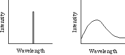
What we perceive as color is really differences in the wavelength of light. Many colors can be generated by a single wavelength of light, such as red and green. Other colors can only be produced by light containing a number of wavelengths, such as purple and pink. To describe the wavelengths contained in a color a spectral density curve can be drawn. This is a graph that has wavelengths along the x axis and light intensity along the y axis. Colors that are produced with a single wavelength have all their intensity at a single spot on the x axis, while other colors contain a mix of wavelengths. This is illustrated in the following diagram.

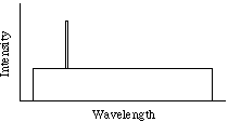
One serious problem for describing color is that multiple spectral densities can be perceived as the same color by the human eye. This makes it difficult to describe colors based on their spectral density curves. To get around this problem, a color model was produced that maps each visible color into a unique spectral density. In this model, each color is specified by a hue, saturation, and its luminance. The hue of a color is the wavelength that is most prominent in the color, which appears as a vertical spike in the spectral density curve described by this model. The saturation of the color is the proportion of it that lies within the spike describing the hue. To de-saturate a color, one only needs to add white light, which is composed of all the visible wavelengths of light. A de-saturated color, such as pink, is thus described as the hue (red) mixed with a certain percentage of white. Finally, the luminance is the area under the entire spectral density curve, which determines how bright or dim the resulting color is. A diagram of this appears below.

While the color model described above is useful, it doesn't describe how colors relate to one another. One mechanism for understanding colors is color algebra. In color algebra, = refers to colors that appear the same, which may have different spectral density curves. It has been found that if color A = color B:
	A + C = B + C
	A * a = B * a
This means if colors that look the same have the same third color added to them, the new colors obtained will look the same. The second statement means that if two colors that look the same are scaled (the luminance is increased by a certain amount for all wavelengths), the new colors obtained will again look the same.
Color has been found to be three-dimensional, which means that any three colors can be used to describe a color space as long as a combination of two of the colors cannot be used to produce the third. Due to the eye's sensitivity to red, green, and blue, the RGB (Red Green Blue) system is commonly used, such as in monitors.
Within the three-dimensional space defined by axes for red, green, and blue, it is possible to graph all the colors. To represent this numerically, any point in the RGB space can be described by the proportion of red, green, and blue in the color. These proportions are commonly represented by numbers between 0.0 and 1.0 for each component. For example, the following are color specifications with this system:
	1.0 R + 0.0 G + 0.0 B = bright red
	1.0 R + 0.75 G + 0.75 B = pink
	0.5 R + 0.2 G + 0.8 B = purple
	1.0 R + 1.0 G + 1.0 B = white
	0.0 R + 0.0 G + 0.0 B = black
Within the three-dimensional color space, a two-dimensional curve can be drawn that contains all the points that represent colors containing only a single wavelength. While theoretically these colors can be described using the above specification method, some of these require negative values for one or more color component. This is true for all choices of three primary colors, which results in the problems we face in color representation. The reason for this is that adding colors together reduces saturation (saturation is inversely related to the number of color wavelengths), so a fully saturated color cannot be produced by adding other colors together.
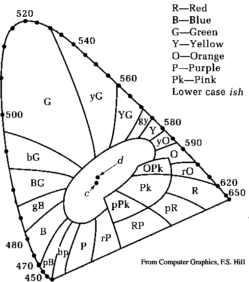
To handle this, the international commission on illumination (CIE) defined three supersaturated primaries that can be combined to form all colors. While these supersaturated primaries have no physical representation, they can be used to produce a chart with all of the colors. Instruments have also been designed that can measure the CIE color specification from real-world samples. A copy of the CIE color chart appears below.

One unfortunate problem with the CIE color chart is that equal distances on the chart do not always represent equal distances in perception. The CIE color chart does allow many calculations to be done, however. Each of the points along the outer rim of the curve, excluding the straight section, are composed of single wavelengths of light. The two labeled points near the center of the diagram, c and d, represent slightly different versions of white. Drawing a line from the desired white point through any point on the chart until it intersects the edge of the graph can be used to determine the primary wavelength (hue) in the color at that point. The saturation of the color is the ratio of the distance from the point to the edge of the graph and the distance from the point to white. Also, if a line is drawn between any two colors on the chart, all of the colors on the line between them can be created by combining those colors by the proportion of the distance to the desired point.
From looking at the CIE color chart's shape it is evident that no selection of three colors can be combined to represent all of the colors on the chart. For monitors, which work by the additive color system, amounts of red, green, and blue are added to create colors on the screen. This results in a triangular shape on the chart that defines the colors that can be reproduced. This shape that defines the colors that can be reproduced is called the gamut. Since color printers do not have colored dots completely overlayed on one other the shape of printer gamuts are very irregular. This results in problems with color matching, where some colors on monitors cannot be produced on printers and vice-versa. This also occurs between different printers and to a lesser extent between different monitors due to differences in the selection of primaries and color reproduction methods. Finally, even on identical devices colors may look different due to calibration errors, differences in the ink and paper quality used for printers, and the environment's lighting.
To reduce these problems there are color systems that use calibrated color swatches to define colors. One such system is the Pantone system. When using these types of systems, applications are needed that can specify the specific swatch number, and the printer is responsible for reproducing the swatch color as accurately as possible. By looking at the colored swatch designers can predict the final color better then by looking at the on-screen color. Some systems attempt to produce Pantone colors that look better on the monitor by using a lookup table that defines the characteristics of the brand and model of monitor along with a user specification of the lighting conditions.
While this works fairly well for object graphics design, it works poorly for bitmapped images that have been scanned or rendered by 3-D graphics packages since there isn't an easy way to map color samples into Pantone colors accurately. Instead, some systems, such as Apple's ColorSync, have users select color profiles for their monitors, scanners, and printers. The system then attempts to accurately simulate and correct colors at each step, modifying the input from scanners, output to printers, and the on-screen colors for monitors. These systems are a relatively new development in high-end color reproduction, and are now becoming affordable for individuals. (In fact, ColorSync is free for Apple Power Macintosh and Macintosh computers.)
There are three primary classes of color printers that are popular today. The first is color ink-jet printers, which cost between $350 and $1500 when this was written. These work by spraying three colors of ink on each page. Since these only allow dots to be made or dots not made, colors are simulated by dithering. This makes the printer resolution very important. Some ink-jets use a fourth ink, black, since combining the three color inks often results in muddy brown instead of black. This is called the CMYK system (Cyan Magenta Yellow Black) after the color inks that are used. All high-end color printers use the CMYK system regardless of their mechanism, including the next two printer classes.
Thermal wax printers are more expensive then ink jet printers, costing between $1000 and $5000 when this was written. These work by melting wax and pressing it on the page. Again, since this mechanism can either make dots or not make dots, colors are simulated by dithering, making printer resolution important. The results are generally better then ink-jet printers since the placement of wax is more accurate, however.
The final type of popular color printers are dye sublimation printers, which cost from $2000 to tens of thousands of dollars. Dye sublimation printers can place variable amounts of each of their inks on each spot of a page, allowing them to create photo-realistic images with relatively low resolutions. Dye sublimation printers are used for professional work like magazines and brochures.
One problem with color printers are their material costs. While each of the better classes of printers cost more to purchase, their supplies cost even more. Many of the better quality printers not only require more expensive inks or wax, but also need to use special paper that is expensive. Costs for color printing can run from $0.50 to $20 for an 8 x 10 page in printing supplies alone. To help reduce some of this cost, many new printers support thermal wax and dye sublimation simultaneously, allowing inexpensive proofs using thermal wax and final copies using dye sublimation.
To produce good color rendition throughout the entire imaging process, color correction must be performed. While systems are now being sold to help reduce this burden, it is still necessary to think about color theory and try to compensate for problems to get high-quality colors.
The information for the color theory through CIE sections of this document comes from Computer Graphics by F. S. Hill Jr. The remaining information comes from miscellaneous sources, including trade magazines and conferences.
meyerd@cs.WPI.EDU