
Due date: Tuesday, March 21st, 11:59pm
The goal of this project is to get used to part of the game analytics pipeline, applying the pipeline to PlayerUnknown’s Battlegrounds (PUBG). You will import data into a spreadsheet program (e.g., Excel), then work to querying, extraction and analysis of the data through a report with charts and tables. The tool pipeline will be used for subsequent projects, including a more advanced analysis of game data.
Gain an understanding of the PUBG game fundamentals to inform your analysis.
PlayerUnknown’s Battlegrounds (PUBG Studios, 2017) (PUBG) is a battle royale shooter game in which up to one hundred players fight in an large-scale arena to be the last one alive. Players can choose to enter the match solo, duo, or with a team of up to four. The last person or team alive wins.
Players start by being airdropped onto an island where they are to scavenge towns and buildings for weapons, ammo, armor and first-aid kits. Items are procedurally distributed on the island at the start of a match, with high-risk zones typically having better equipment. Players then fight and/or hide to be the last one standing. Every few minutes, the “safe zone” shrinks corralling players closer and closer together.
Learn a bit about PUBG. You are encouraged to play (the game is free to play), but you can prefer to read and/or watch gameplay videos instead. Some links that may be useful include:
Video: [Pending]
Guide: [Pending]
Game: [Wiki]
Setup tools and download data in preparation for analysis.
At this point, the primary installation is of a spreadsheet. Choose the installation method appropriate for your Operating System and install a spreadsheet:
https://its.wpi.edu/article/315/install-office-365-on-personal-machine
sudo apt install libreoffice
For data analysis on this project, we will use some pre-captured data on PUBG: “PUBG Match Deaths and Statistics”. The original data was captured by Kevin Pei about 4 years ago and contains extensive data from 720,000 competitive matches extracted from a public game analytics Website. While a rich data set to explore, it can be unwieldy to analyze being over 20 GB in aggregate.
Instead, we will use a subset of the data initially extracted by Akash Aggarwal (https://www.kaggle.com/zyabxwcd/extracted-agg-match-stats-0) and further reduced to 1000 matches:
Once extracted (unzipped0, the resulting data.csv file is in comma separated value format (also known as CSV) so can be opened directly by your spreadsheet program. Once you have downloaded, extracted and opened the data, you should see something like:
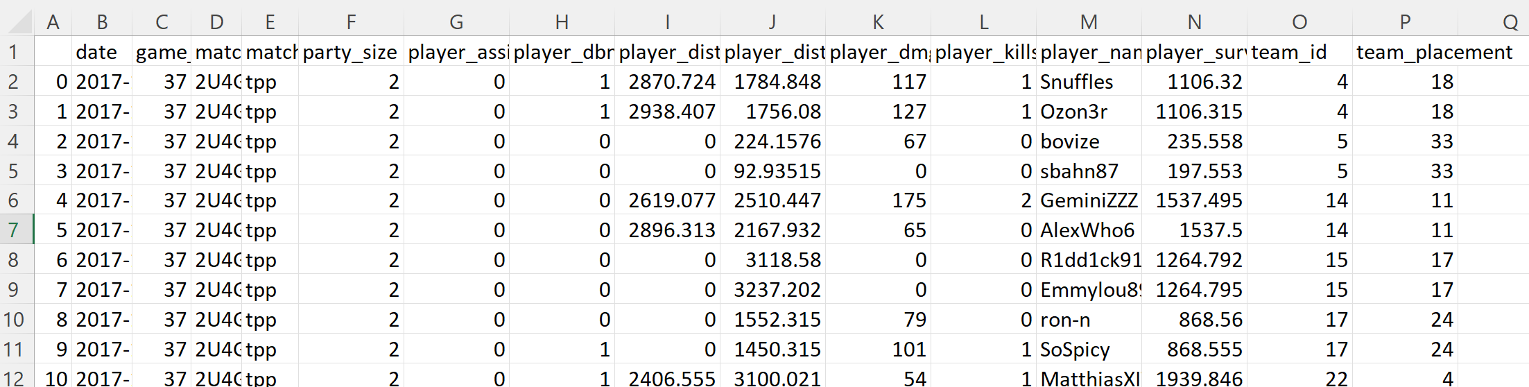
with one match per row and stats in the columns.
When done, proceed to part 1.
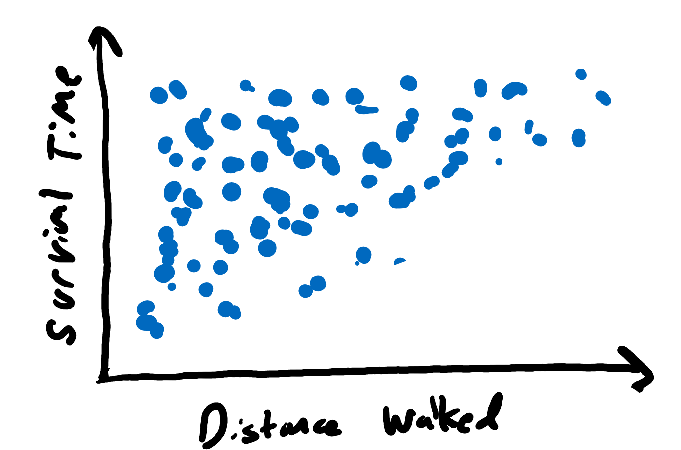
In PUBG, to survive, players can either run or fight (or both). Your first analysis will be to explore the relationship between moving (walking) and survival time and fighting (damage) and survival time.
This analysis should be in the form of two scatter plot charts, one for movement and one for fighting. For example:
To draw the chart, use your spreadsheet’s (e.g., Microsoft Excel) built-in drawing tools. The scatter plot chart (and many charts), needs to have the data in two columns. Something like:
    player_dist_walk,  player_survive_time,
    1784.84778,         2.32,
    1756.07971,         3.315,
     224.157562,       10.558,
      92.93515,         7.553,
In general, you need to select the two relevant columns, and then create/insert a chart from the data. In Excel this is “Insert” -> “(Chart) Scatter”.
For help with selecting columns:
There are lots of online resources for making spreadsheet charts. One such is:
Another on scatter plots in Excel:
For the above link and all below, if your version of Excel does not match the tutorial, hit F1 for “Help” and then type your query (e.g., “create a scatter plot”).
You may notice the distance data has a few outliers - points that are much larger (or smaller) than most of the others. To help with analysis, scale the x-axis from 0 to 15000. To do this, right click the x-axis, -> “Format axis” –> “Bounds” and change the values.
Make sure to label your axes - typically the axis is named and the units are in parenthesis (e.g., “Distance walked (m)”). To do this, once the chart is inserted, press the “+” button –> “Axis title” and then modify appropriately. Adjust the chart title, too.
From the charts, what are the general trends?
Are there any visual outliers in your charts?
Does the trend for survival time look stronger for distance or damage?
Place your charts in a report, with a figure numbers and descriptive captions (E.g., Figure 1. Survival time versus Distance walked.). Describe the axes and the data. Then, provide your interpretation of the chart (e.g., your answers to the “Explore” questions).
As noted in Part 1, game times can vary widely for, say, the first person killed compared to the last person standing.
Compute the average game time (player survival time) across all players. The =AVERAGE() formula can be used to compute an average in excel. See:
https://www.goskills.com/Excel/Resources/How-to-calculate-average-in-Excel
To compute the average for an entire column, say column N, try =AVERAGE(N:N).
There are similar formulas for standard deviation (STDEV), minimum (MIN) and maximum (MAX). Compute all of these for the game times for all players.
Analyze the distribution of the data using a histogram. Something like:
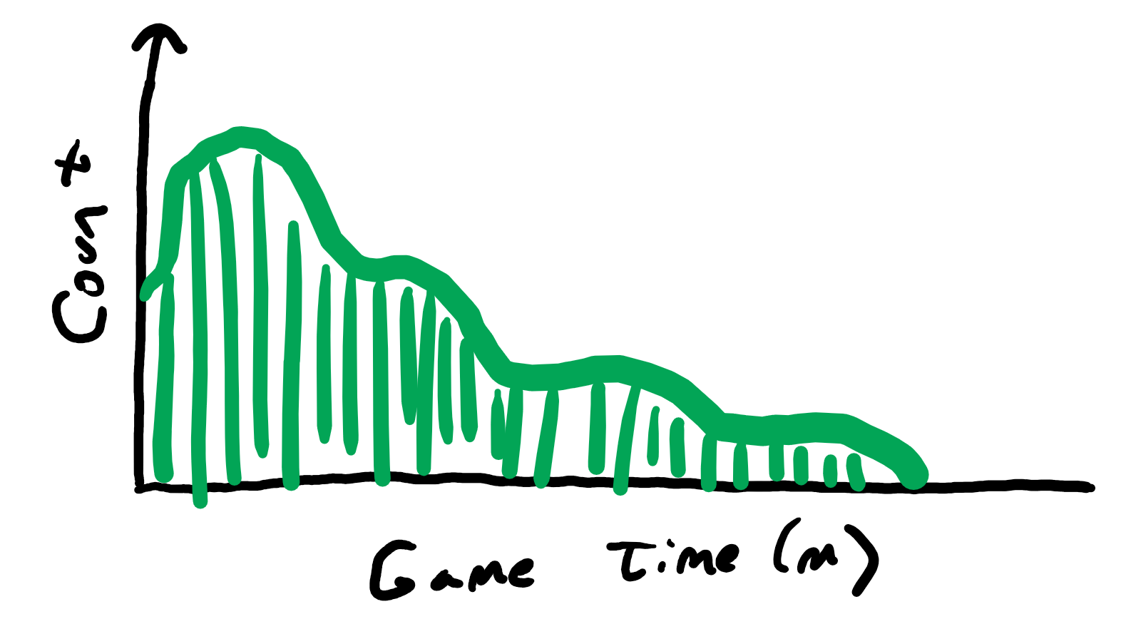
You should use a 1 minute as the bin size.
Note, as for your earlier graphs, you can change the x-axis formatting. Right click the x-axis, -> “Format axis” and set the bin size. You should also set data type to a “Number” with only 1 digit after the decimal point.
Other tips for drawing a histogram with Microsoft Excel can be found at:
If your version of Excel does not match the tutorial, hit F1 for “Help” and then search for “create a histogram”.
What do the summary statistics tell you about the data?
What happens to the shape of the histogram when you change the bin size?
What is happening at the ends of the histogram (very short game and very long game)?
Make a new section for your report. Include all your summary statistics (average, standard deviation, minimum and maximum) as a table. Include a caption for your table as you did your figures.
Include your histogram, with a number and caption. Describe the axes and the data. Then, provide your interpretation of the chart (e.g., some of your answers to the “Explore” questions).
The length of each game may vary with team size.
Compute the average game length for each player games with 1, 2 and 4 players per team, separately.
In order to do this analysis, you will need to select only part of the dataset. E.g., select only those games with a team party size of 1.
You can do this in Excel with filters. In short, select the cell with the value you want to filter, right click and choose “Filter” -> “Filter by Selected Cell’s Value”.
See: “How to filter values in Excel”:
https://www.ablebits.com/office-addins-blog/2016/08/31/excel-filter-add-use-remove/
Once selected, you can select all the visible data, then copy and past it into a new tab. To select all the visible data:
Create a new tab by clicking on the “+” in the bottom of the spreadsheet. You can rename the tab right clicking -> “Rename”. Then “Paste” the data into the tab.
You can do the above for each team size.
Once done, compute the average game length for games with each team size using the same methods as in Part 2.
Once you have computed the averages, display your data as a bar chart with each team size clearly depicted. Something like:
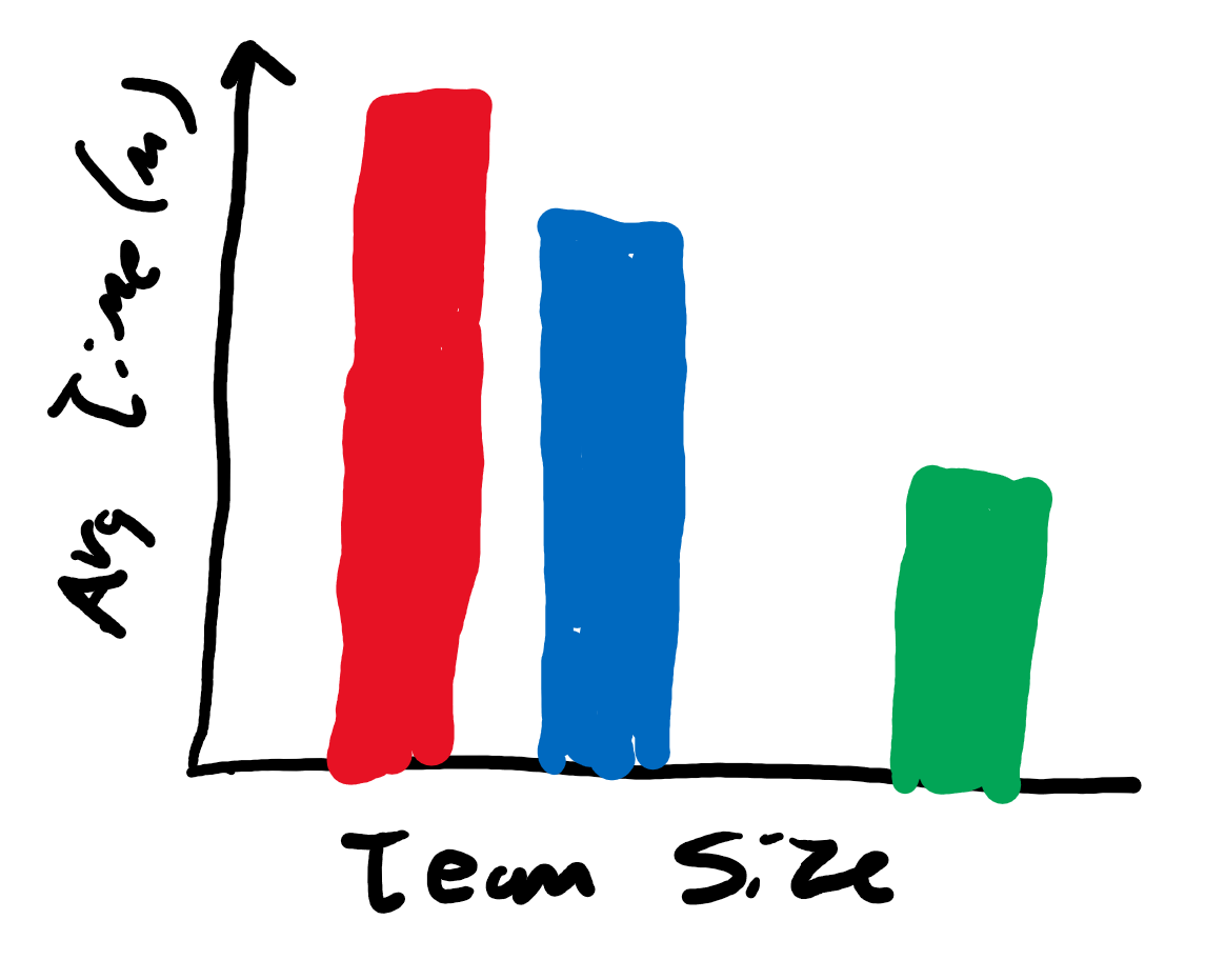
Again, make sure to label your columns and axes.
There are different ways to create text labels (e.g., “Team 1”) for the x-axis bars. One way is via custom labels:
What are the differences in game time based on team size?
Are the differences explained by different features of the game? (Hint: consider aspects of team play that differ than solo play.)
As before, place your chart in a report, with a figure number and descriptive caption. Provide your interpretation of the results.
Pick another, as of yet analyzed aspect of the dataset (not a new dataset) of interest to you and analyze it. This could include new, un-analyzed game stats (e.g., Kills) or filtered data (e.g., game time for winning teams/players). Feel free to be creative!
This analysis must include a chart and may include a table or other statistics.
As always, provide a figure number with caption and your interpretation.
Writeup a short report on the above analysis. Include a very brief introduction to the game, and a very brief description of the methodology including the data set. Have clearly labeled sections for each part (e.g., Section 1). Note, you do not need to include Part 0 - Setup in your report.
All results in the form of charts and tables should:
For reference, consider a good example of descriptive text to accompany a chart made through data analysis.
Remember, the independent variable on the x-axis (horizontal axis) and the dependent variable on the y-axis (vertical axis). The independent variable is the one that you manipulate, and the dependent variable is the one that you observe. Note that sometimes you do not really manipulate either variable, you observe them both. In that case, if you are testing the hypothesis that changes in one variable cause (or at least correlate with) changes in the other. Put the variable that you think causes the changes on the x-axis. Either way, the title/caption for the graph is read as y-axis versus/by x-axis (e.g., “Kills by Team Size” or “Survival Time versus Distance”).
The comments below are common mistakes from previous years. They may pertain to your project. They are not provided in any particular order. Nor are they equally important.
Number all pages.
Sections should be numbered and with a name/label (for example, “Section 1. Matches” instead of “Section 1.”).
Charts/figures do not need a title and a caption. In general, use a caption only. Chart titles may be fine for a presentation.
Using color to differentiate points (and lines) is ok (even good), but they should also be distinguishable in black and white. Black and white is still the lowest common denominator - some people are color blind, many printers don’t do color and even some devices do not differentiate with thickness and/or hashes and/or point types.
Excel provides horizontal lines and grids on charts by default. These are almost always not needed and provide unnecessary “ink”, clouding the message.
Excel may choose axis marks that make little sense (e.g., 1, 7, 13 …). Control the axis marks to provide something that is natural given the data.
If a chart has a single data series, a key/legend is not needed.
Figures are numbered separately from tables (e.g., Figure 1, Figure 2 and then Table 1 and Table 2). Also, use capitalization for each.
Histograms should not have spaces between the bars (or only very small spaces). Also, a bar with one number below it (e.g., 25) is not clear - does it represent, e.g., 20-25 or 22.5 - 27.5?
Think about font size when placing a chart in a paper. In general, the font size of the embedded figure should be comparable to the paper itself.
When you turn in your assignment, make sure to submit PDFs only. Word docs or other formats are not acceptable.
Write formally. Avoid conversational prose (e.g., “it was insanely large”) and hyperbole (e.g., “the most ever”). Similarly, do not use contractions (e.g., “don’t” - instead use “do not”) and do not use second person (e.g., “you”, “your”, and especially “y’all”).
Check the number of significant digits on a computation. Just because Excel can provide a mean of 12.8215132511 does not mean all digits should be reported. First, are they really significant or are they within the error of measurement (e.g., for time which is measured in seconds)? Second, does it really help the reader? e.g., better would be 12.82 or even 12.8.
If embedding a picture taken from a screen shot, be sure to choose a high resolution monitor, enlarge the picture as large as possible and then take the screen capture. This will minimize the chance of it looking blurry in the document.
The assignment is to be submitted electronically via Canvas by 11:59pm on the day due.
The submission is a report in PDF, named:
proj1-lastname.pdfwith your name in place of “lastname” above, of course.
To submit your assignment (proj1-lastname.pdf):
Go to the canvas page for the class
Navigate to:Assignments->Project 1
Click:Submit Assignment
Click:Choose File
Select the zip file:proj1-lastname.pdf
Click:Submit Assignment
Important - you must click the Submit Assignment button at the end or your file will not be submitted!
When successfully submitted, you should see a message similar to:
Submission
- Submitted!
Mar 20 at 10:51pm
Postmortem slides: pptx
All accomplishments are shown through the report. The point break down does not necessarily reflect effort or time on task. Rather, the scale is graduated to provide for increasingly more effort required for the same reward (points).
Part 1 - 30% : The analysis of movement and damage versus survival time represents a large chunk of the grade. Completing this part means a basic tool pipeline is setup and can be used, with a basic demonstration of one full-set of analysis.
Part 2 - 30% : The analysis of survival time distribution and statistics is worth a sizeable chunk, too. Completing this demonstrates using formulas and another chart type.
Part 3 - 20% : The analysis of team size in additional chunk, too. Completing this demonstrates an additional analysis skills (selecting part of a data set), and use of another chart type.
Part 4 - 10% : Analyzing an aspect of choice from the data set is worth a smaller fraction, but still about one letter, of the grade as it represents the “icing on the cake”. It shows an additional set of queries as well as new insights that are self-driven.
Misc - 10% : Miscellaneous parts of the report (e.g., other sections, overall writing, formatting, etc.) are worth about a letter grade.
100-90. The submission clearly exceeds requirements. All parts of the project have been completed or nearly completed. The report is clearly organized and well-written, charts and tables are clearly labeled and described and messages provided about each part of the analysis.
89-80. The submission meets requirements. The first 2 parts of the project have been completed well, but not parts 3 or 4. The report is organized and well-written, charts and tables are labeled and described and messages provided about most of the analysis.79-70. The submission barely meets requirements. The first 2 parts of the project have been completed or nearly completed, but not parts 3 or 4. The report is semi-organized and semi-well-written, charts and tables are somewhat labeled and described, but parts may be missing. Messages are not always clearly provided for the analysis.
69-60. The project fails to meet requirements in some places. The first part of the project has been completed or nearly completed, and maybe some of part 2, but not parts 3 or 4. The report is not well-organized nor well-written, charts and tables are not labeled or may be missing. Messages are not always provided for the analysis.
59-0. The project does not meet requirements. No part of the project has been completed. The report is not well-organized nor well-written, charts and tables are not labeled and/or are missing. Messages are not consistently provided for the analysis.
 Return to the IMGD 2905 home page