Introduction
Stop Disasters! is a resource management strategy game designed to teach about the warning signs of disasters as well as methods of reducing casualties and damage as a result of natural disasters.
The player assumes the role of a contractor in charge of improving the area's response to specific natural disasters. Within a set time limit, the player must manage their resources in order to construct and reinforce local buildings, conduct training, and purchase warning systems to help make the community safer.
Below is a detailed analysis of this game roughly following Brian Winn's1 Design/Play/Experience framework, including:Learning
The intended learning outcomes of the game are:
- Encourage players to learn about disaster preparedness plans
- Reduce the financial costs of disasters
- Increase knowledge about the cost of disasters
- Reduce the human costs of disasters
- Loss of life and injuries
- Time spent repairing community
Storytelling
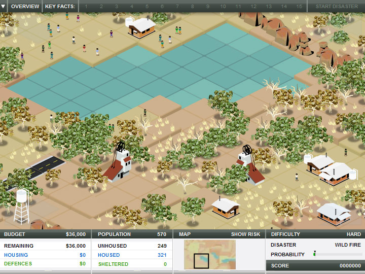
Each scenario takes place in various locations around the world and focuses on disasters common to that area. For example, the tsunami scenario takes place in Southeast Asia, while the wildfires scenario takes place in Australia.

The player controls an unnamed character and NPC character designs are minimal. The only interaction between characters are the advisor messages that occasionally appear on screen. However, the advisers have no dialogue that does not relate directly to the current challenge.
Besides the premise of a contractor and the knowledge of an impending disaster, the game has very little story. This premise supports learning by putting the player in the position of making key choices for the community. This experience gives the player a hands-on opportunity to learn about preparations for disasters.

The minimal story greatly detracts from learning. Firstly, without any connection to the people or the local culture, the player remains distant from the situation and feels no urgency or need to protect the community. The player will not identify with the community in the game and will not be motivated to help build and maintain it. The actual experience in the game is not similar to how they would behave in real life. Thus, there is little transference to the real world in terms of changed behavior and attitudes.
Additionally, the limited complexity of the advice the advisers gave meant that the player did not get an opportunity to really understand the different sides of the issues. For example, the tsunami scenario included an adviser that tried to encourage the player to build hotels near the beach, without explaining the economic reasons why a hotel would want to do so. Very little explaining of the issues takes place, so the player already has to know before beginning the game which ideas are reasonable and which are not.
Gameplay
The player is given a lot of freedom to make choices in the game. They can choose what to develop and where to develop it, and they can choose between developing buildings or creating defense systems. Once a structure is made, they can choose if or how they will upgrade it. The player has a set budget and they can decide how to distribute their money and which members of the population to spend it on.
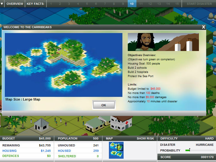
The player is given a generic amount of time before a disaster strikes. They can use that time to invest in their community and build structures, create defenses, and invest in warning systems and population training. Each scenario comes with a list of goals that must be met before the disaster strikes. For example, the player might have to build a school, house a certain amount of people, and develop the local economy (such as building a certain number of hotels). Each scenario also has some generic goals related to lowering the costs of the destruction and loss of life during and after the disaster. The challenge comes from managing the resources available: limited time and money and terrain-related building restrictions. The player is not given any implicit directions once the game controls are explained and is expected to figure out the game strategy on their own by clicking on objects and trying out different actions.

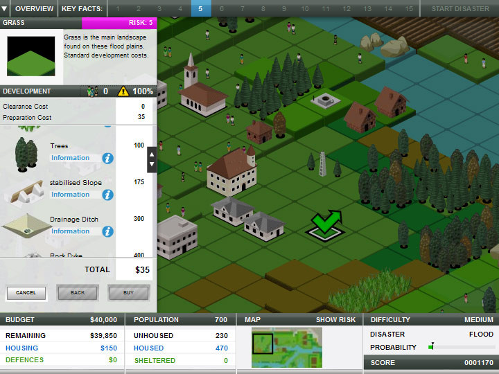
The game is a real-time, self-guided, point-and-click, grid-based map simulation. The player interacts with the game by clicking on objects on the map and on menus. All actions can be completed with the mouse. The player is expected to find information independently, and will be rewarded for exploring and making good choices with tooltips that appear after the action has been completed. This self-guided nature of the game reduces the learning component by preventing the player from acting purposefully on this information. A player's knowledge may actually be minimized by this method because they may not be able to find all of the tooltips in the allotted time. However, the option to start the disaster early was useful as a self-guided feature because the player may finish before the time is up.
Within a scenario, very little changed. Occasionally the player would receive a pop-up from an advisor, but the game itself did not change drastically and there was very little feedback. Gameplay was highly predictable. Between scenarios, options were available for different difficulties that reduced the time and money available while increasing the map area, the goal requirements, and the severity of the disaster. Each scenario contained a different disaster and different techniques for reducing the disaster's effects.
The game is not very engaging and did not give the player any sense of urgency. It also does not lend itself to replayability, because all of the situations are fairly similar. Three of the disasters contained water disasters and required almost identical strategies. This could also impede learning as players may end up confused as to the difference between these disasters.
Gameplay supports learning by putting the player in control of their knowledge. Some challenges, such as building hospitals and schools, make sense and contribute to learning by teaching the player that these buildings are places of refuge.
On the other hand, gamplay detracts from learning due to the lack of realism. Most storms are unpredictable, whereas in this game every storm is always presented the way the player expects them to behave. The game seems to be presented in real time, but the player is still constructing defenses much quicker than seems realistic, and there is no realistic measure of time in the game (ex. a ratio of minutes played to in-game years).
This game is not well-balanced. As a result, it loses credibility as a simulation. The development costs, time spent, predictability of disasters, options available, and character interactions are all clearly simplified. All purchases were displayed in US dollars, with no currency equivalents presented. It was difficult to understand the actual cost to the community when it was clear that the prices displayed were not representative of the local economy or the actual cost in US dollars.
User Experience
The controls were really simple. It encouraged players to explore due to the point-and-click style. The interface included a simple HUD that kept track of how many of the population were sheltered as well as the remaining budget and time. The map is populated with interactive objects and squares. Every square on the map can be developed with a building, improved with a defensive feature, or queried for information. Large arrows in each corner are used to navigate the map itself. These arrows would remain in place even if that end of the map was reached and gave no visual sign that the action was no longer allowed. In addition, these arrows blocked access to squares that could otherwise be built upon, requiring the player to be continuously moving around the map to access key building sites.
It is clear how to use the interface, but it is not clear how it acts in the game. For example, the arrows mentioned above obscure the boundaries of the map, so the player can never tell where the accessible areas end.
The size of the game screen was far too small considering all of the information displayed in it. The menus were far too small and were hard to click on. In addition, key space on the interface was taken up with redundant information while important information was hidden. The game contains a detailed list of instructions but does not tell the player of key features hidden in some of the menus.
Technology
The game is made in Flash for online play. No major bugs were noticed during review. The size of the game, as mentioned before, was a poor choice, although the designers may have wanted to make the game fit on many different screens and were probably designing for the minimum resolution possible (800x600 displays). The game itself is generally stable. One speculation as to why that is the case is because minimal animation gives minimal opportunity for problems.
Assessment
A study conducted with high school students in Rio de Janeiro described the student impressions of the game as well as its educational impact. Students were given pre-tests and post-tests on the topic of flooding (as this is an important disaster in Brazil). The post-game survey was given to evaluate the game from the play session and to assess any improvements needed.
Conclusion
Stop Disasters! is a good idea that was poorly executed. It provides a lot of good information in tooltips, but the way that the information was presented — after a player had performed an action, sometimes randomly — did not help the player learn. The game also does not tell the player when they've done something wrong, even in a tutorial level.
We believe our discussion here has described some improvements that the game could use. In summary, some of those improvements include better user interface, a better way to relay information to the user, more realistic portrayals of situations, better graphics and animations, and a larger variety of missions.
Discussion Questions
- Did you develop a strategy while playing, or not? What strategy or strategies did you use?
- Is the awareness this game is trying to raise productive? In other words, would learning something from this game cause a social change?
- Does the game have an appropriate target audience? If not, who do think the audience should be?
- How does the user interface compare to similar games in this genre? Even if you have never played a strategy game, how did the user interface seem to you?
- Does this game seem realistic?