 |
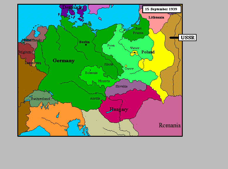
Here we see nominal data (nation) mapped to colors. Notice that the colors aren't in an organized scale in any sense. There are no obvious color ramps to imply order. We simply map nomimal values onto discrete colors. |
Non-Transformational Techniques
What we mean by non-transformational is simply that we map nominal data directly onto nominal graphical primitives. The location of the graphical primitives on the screen/picture is determined by some other interval-valued data.
 |
Here we see nominal data (nation) mapped to colors. Notice that the colors aren't in an organized scale in any sense. There are no obvious color ramps to imply order. We simply map nomimal values onto discrete colors. |
We can equally well map nominal values to discrete icons or glyphs.
In this picture, we have 64 data points, where each data value is one
of:
|  |
One can argue that this form of visualization of nominal data oversimplifies the process. Are there visualizations which we can not create with this approach?
Transformational techniques
A nominal variable contains one of m values. The most natural transformation we might apply to a set of nominal values is a frequency-based analysis. Given n nominal data points, each with m possible discrete values, we create a new table which counts the frequency of each value:
|
------ > |
|
In this example, we've transformed our nominal data into interval data. It's a straightforward job now to map this data to the kinds of graphical entities most appropriate for interval data (e.g. columns of a histogram).
The Truth
The truth of the matter is that we rarely we see nominal data without brothers and sisters. Most data sets have many columns, some of which contain nominal data, some of which contain interval data, and so on.
Standard visualization techniques fall into two categories:
If we don't intend to reduce our data set, then we must map our nominal data in a non-transformational way. The remainder of this presentation, then, focuses on reducing approaches to visualizing data.
The Reductionist
Given a table of data, if we want to reduce the amount of data, we have two choices: cut out some rows, or cut out some columns. In practice, the former is often called clustering, and the latter goes by many names, depending on the technique.
Grouping Columns
| We've already seen a form of this kind of grouping in Chris Bentley's and Matt Ward's MAVIS program. Here, the n columns of a table are reduced to 2 (or 3), and this program animates the optimization process (the assignment of 3-space vectors to previously n-space vectors). |  |
How does nominal data fit into this? The process of multi-dimensional scaling entails determining the distance between every two points in n-space, and then coming up with a table which most closely approximates those same distances in 3-space. How do we calculate distance of a nominal variable? Certainly, a simple approach is:
distance = (i == j);
and indeed, this metric would enable MAVIS to operate on nominal
data. It is unclear at present how meaningful this distance
metric is, but more complicated ones can be derived.Principal Components Analysis and Factor Analysis are alternative methods of removing columns of a dataset. These statistical approaches attempt to to discover which sets of variables in the set form coherent subsets that are relatively independent of one another. And again, they require calculating distances between data points. We might use the above distance metric, or a more complex one, such as:
Distance(x,y) = abs(Dx - Dy)
This metric allows for some additional variability depending on how common a value is.
Grouping Rows
Clustering of data is a highly effective tool for visualization as well. Clustering is generally used to either:
2. Group the data points into clusters for hierarchical access to that data.
Many algorithms exist for this type of grouping, and they work quite similarly to the way in which Principal Components Analysis works. The idea is to find a way to determine how close points are to each other (in terms of, you guessed it, distance), and to form groups which minimize the total energy of the data set.
How does nominal data fit into these types of transformations?
In exactly the same way. We need to be able to calculate distances between data points to determine whether they belong in the same cluster. Indeed, we have already provided two potential distance metrics for nominal data.