Introduction
At-Risk On Campus Students is a game where the player role-plays through conversations with students, making choices on how to interact with the students as they learn to recognize symptoms of psychological stresses and hopefully reducing the stigma associated with mental illness.
Below is a detailed analysis of this game roughly following Brian Winn's1 Design/Play/Experience framework, including:
Learning
Learning
At Risk On Campus Students is an interactive course that prepares users to:
· Recognize signs of psychological distress
· Learn how to approach at-risk students
· Manage challenging and sensitive conversations surrounding mental health
· Make appropriate referrals to campus support services
Storytelling
In the introduction we learn that At Risk is about helping a friend in distress and learning
how to talk to them about sensitive objects. You play as a guy named Jesse who has four friends named Anna, Mike, Travis, and Taylor.
One of his friends is in distress, which can lead to trouble in school.
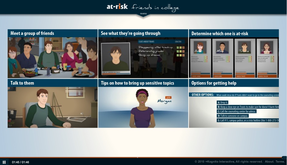
In the next section Jesse learns that Travis is the friend in distress, so Jesse goes over to Travis’s
apartment to check on Travis and to let him know that you are there for him. The player learns that
Travis is behind on his school work and thinking of switching majors, and it’s putting a lot of stress
on him.
By putting the player in the shoes of Jesse, it helps to teach the player tips on how to approach a
friend with issues and how to just come out and start the conversation.
Gameplay
Near the beginning of the game, the player is first given a pre-questionnaire to gauge their
experience with having friends showing signs of psychological distress.
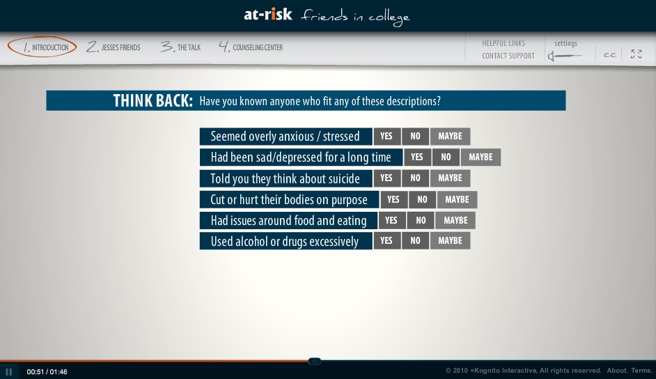
Gameplay then moves towards a conversation simulation with a distressed friend.
The game is based on decision making, with a teaching agent to help the player stay on the right
track in the conversation. When the player goes over to talk to Travis as Jesse, they are given
options from a menu to steer the conversation, such as making an observation or small talk.
When the player goes off topic or makes a bad talking decision, such as getting too far off course,
the teaching agent in the form of the guidance counselor pops up from the advice bar to try and steer
the player back to the topic. If the player picks a particularly bad option or doesn’t like the option
they choose, they are given the option of undoing the last decision and trying over.
User Experience
Gameplay during the conversation is based around pointing and clicking. By selecting
what to say through a list of provided options, the player holds a simulated conversation.
The user interface is designed to be sleek and light. Conversation options
are listed in a simple blue menu to the left of the screen. Hovering over the different
options for kinds of conversation leads to a submenu where you are provided with choices
on what you want your character to say. As you make choices, you may want to take back
something that you have said after learning why it might not have been the best choice.
An option to undo the last choice you made is provided below the conversation menu. It is a
small, orange undo button that should help curb accidental clicking.
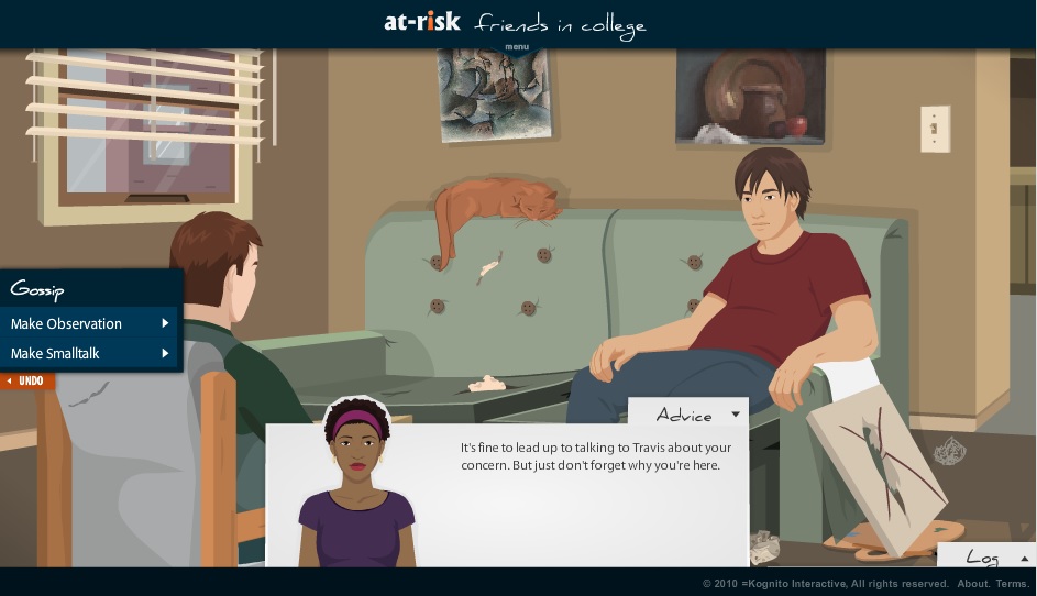
On the bottom of the screen, there is an advice tab that stays hidden until you
select it. This tab provides contextual information on what you might want to say
next, or why what you have just said might not have been correct. It highlights
when there is something especially important to bring up, but otherwise is unintrusive.
The bottom right corner of the screen has a log tab similar in function with the advice tab,
but which has information on the player's previous choices and how the conversation has
played out so far.
There is also an additional menu at the top of the screen containing options to change
game settings as well as having links related to the topic and contact information. The current
part of the game that the player is in is also displayed. This menu is completely hidden during
normal gameplay and will only reveal itself if the player hovers towards the top, acting unintrusive
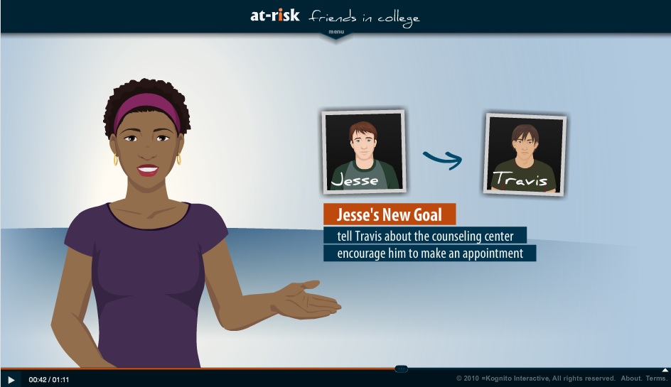
when it is not needed. Video portions of the game are shown through a light video player that allows
the player to pause as well as go back in case they need to rewatch a part.
Technology
At Risk On Campus Students is made in Adope Flash. It is well polished and provides seamless video as well as a simple to use 2D environment. However, Adobe Flash is becoming more and more outdated as mobile options are unable to use it. A better option in order to reach a larger audience could be HTML 5, as it would allow for a broader mobile base where the 30 minute maximum gameplay would be viable. Beyond this, the current implementation is effective in accomplishing its goals.
Assessment
Kognito Interactive has run a study2 to determine the
effectiveness of its game, and is listed in the National Registry of Evidence-Based Programs
and Practices. They ran a study for 1.5 years with 270 students at 20 different institutions.
The participants were given pre-surveys and post-surveys after using the game. They found that
participants had learned gatekeeper skills (suicide identification and intervention) and retained
those skills after a 3 month follow up, showing high transferrence.
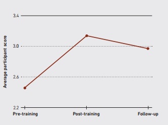
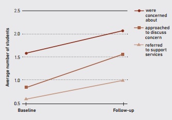
They also found after a 3 month follow up that participants were more likely to consider using
campus support services and were more likely to refer others to campus support services.
Participants also were more likely to report that they would seek help from the campus
support services if they were ever psychologically distressed.
Participants also rated the program highly, with 98% rating it well on the post-survey and 92%
saying that they would recommend it to others. 98% said that it was an easy to use program, showing
its usability and 96% said that the content was relevent to what they would experience. This study
overall showed the value and success of the game, with the only point of contention being that
it was run by Kognito Interactive themselves, so there may potentially be conflict of interest.
Conclusion
Overall, this game was effective in teaching gatekeeper skills and would be a useful tool to help teach college students about suicide prevention. College is a stressful time where students feel anxious and nervous, with these feelings being hard to discuss with friends. This game is a good way to help learn ways to identify whether your friends need help and how to help them, as well as a good way of learning ways to get help yourself. The only issue we have with the main game is that resources are a bit harder to find within the game, as they are in the upper menu hidden away from normal gameplay. Discussion of what these resources are after gameplay could be useful as a way of ensuring this information is gotten across. Beyond this, the demo does lack some key parts of the gameplay, such as the identification phase, but this is more a function of the demo than a fault of the game.
References
- Winn, Brian. The Design, Play and Experience Framework. In R. Ferdig (Ed.), Handbook of Research on Effective Electronic Gaming in Education. Hershey, PA: IGI Global, 2009, pp. 388-401.
- Albright, Glenn. Using Virtual Role-Play with Avatars to Build Gatekeeper Skills among College Students and Student Leaders. Kognito Interactive, May 2013, pp. 1-4.