Introduction
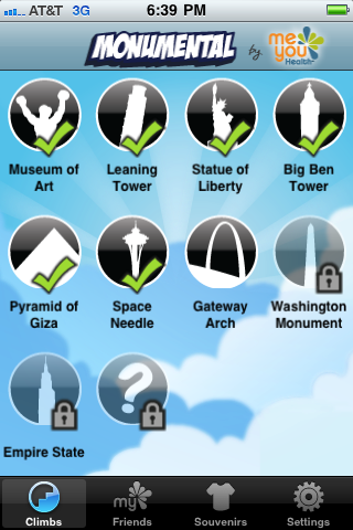
Monumental is a game for the iPhone deployed in the iTunes app store. The focus of
Monumental is to encourage people to take the stairs or to even seek out stairs
when walking. The game also integrates with Facebook to add a competitive element
via the social network. Ideally, the result is that the player is more physically
fit after increasing his or her number and frequency of stairs climbed.

Below is a detailed analysis of this game roughly following Brian Winn's1 Design/Play/Experience framework, including:
Learning
The learning goals of Monumental are simple: teach the player that well-being and fitness is more than just exercise, and encourage the player to increase the number of steps he or she climbs. The latter seems more likely to occur than the former. Although the lead game designer states well-being as a learning goal a blog post, the game play elements do not strongly address it. However, the increase in stair climbing and fitness is directly addressed in the gameplay. This goal is reinforced by using social media to tap into the competitive spirit of humans. By allowing players to post their scores and daily steps on Facebook, Monumental fosters a continuing userbase and delivers replayability.
Storytelling
The story in Monumental is relatively minimal. The player is still himself or herself. There are no characters, settings or plots. However, the social networking element allows players to create their own stories through competition. This competition is based on the gameplay, but exists on Facebook, rather than directly within the game. In this case, the characters are the players and their friends. The setting is the real world because the gameplay is based on real physical actions, and simultaneously Facebook as well because the competition and interaction between characters (players) exists online. The plot is very free form because any number of people can be competing for number of steps, shortest time or souvenirs. While the story is not built into the game and the designer has little control over it, the player story can be very rich, depending on how the players choose to use the game.
Gameplay
The gameplay in Monumental takes place primarily in the real world--or on Facebook
if the player so chooses. The player will start the app, choose a monument to start
"climbing" and put the phone in their pocket. Each step the player takes then counts
as a step toward climbing the virtual monument.

The monuments are all real monuments
and the number of steps directly correspond to how many steps it takes to actually
climb it in the real world. This way, the player can compare their distance traveled
to a famous tall monument. Once the player has reached the top, he or she can see
the view from the top, take a virtual souvenir or share their score. In this case, the
score is the total time it took to reach the top of the virtual monument.

The other element of gameplay is the social networking aspect. A player can invite friends
on Facebook to play monumental and compete against them in time and daily steps. While
this is not directly a part of the gameplay, it fuels replayability and ultimately the
learning goals by increasing play time. And by adding a new basis for actually playing the
game, the social aspect becomes an arena for competition and communication.
User Experience
Most of the user experience during play is not actually created by the app
itself. Since the player has to physically walk up stairs to play, the
experience that occurs in the real world while climbing is the majority
of the user experience during play. The remaining experience comes from
finishing the monument and the social interactions on Facebook.
When the player finishes the monument, he or she has the option to see
the view from the top. This is known as the "surprise" and is supposed to
instill a sense of accomplishment.

However, the screen is small and just a
photograph, so the purpose is somewhat lost. Additionally, the player can
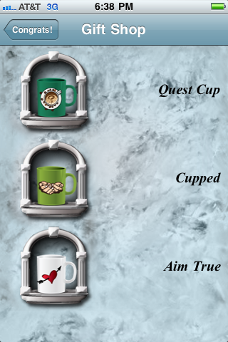
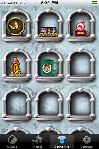
take a souvenir from the monument. This is known as the "reward" and players
can keep a collection of their souvenirs. Although this is relatively meaningless,
the item on Facebook must appeal to somebody.
The other experiences come from social interactions. The addition of Facebook
integration to Monumental is supposed to greatly prolong the user experience by
allowing players to communicate and compete socially. This sociability also
serves the goal of well-being education, but still kind of misses the target.
Technology
The technology for Monumental is straightforward and prudent. It is deployed to
the iPhone which is a mobile device. Delivering this game on anything besides
a mobile device would just be nonsense. The graphics and software are both
low-fidelity. The art style is cartoony and 2D, so there are no complicated
tools or engines required to build or view the graphics.
The software merely
accesses the iPhone's accelerometer through an API and does some basic math to
determine steps. The app also accesses the Facebook web API, which is relatively
simple as well. The remaining software is merely the displaying of images or the
playing of sounds.
Assessment
There is no formal or informal assessment of Monumental that I was able to find. However, the rating on the iTunes app store was 3 out of 5 stars out of about 220 reviews. Overall, I was not especially inclined to walk more frequently. Additionally, when I did walk, I often forgot to start the app. It appears that other users were not much more enamored with the game than I was.
Conclusion
This game isn't bad or necessarily ineffective, but there's a lot of room
for improvement. The most redeeming quality of the game is the social networking aspect. Without
it, I think there would be no hope for success. As for improvements, the game needs to be more
of an actual game. There's really no lose condition--other than not beating your friends on Facebook.
The view at the top of a monument is just a photograph. I think it would be really cool if the
photograph could be scrolled and viewed as a panoramic image, instead. Overall, it's a good start
but could really use some core improvements.
