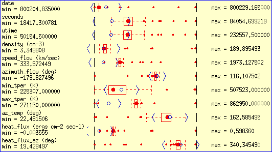
A Tukey box plot. The red
circle shows the median value, the red box shows the outline for the middle 2 quartiles, the red dashed lines shows the points within 1.5 times the 25-75 quartile range of the median, and red dots indicate outliers. The blue circle shows the mean value and the blue angle brackets show the standard deviation.
 This picture was obtained from Matt Ward's
XmdvTool home page.

