Blooper 54: Dialog boxes that trap users
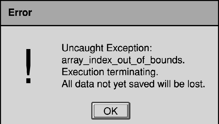
 What's wrong with this?
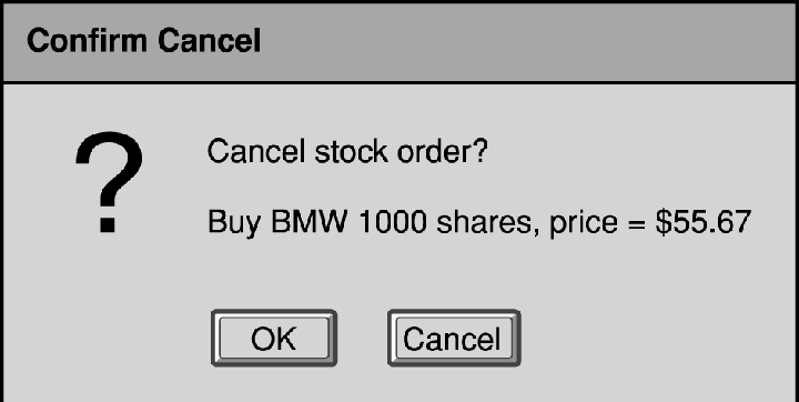
The dialog boxes provide no way out rather than a direction that the user doesn't want to go in.
Variations:
- No choice - dialog box says something bad is going to happen, such as loss of data, and user has no choice but to agree.
- All paths are wrong - dialog box provides choices, but not the ones that the user is likely to want
- Poorly described choices - unclear labeling makes users unsure which one they want
Design Rule:
When designing dialog boxes, especially error and warning dialog boxes, provide the users with sufficient alternatives.
Label the choices clearly so that the user cannot be confused about what the different choices are.
It helps to list the possible intentions of the user may have had when the dialog box was displayed. Keeping the user's
intentions in mind helps because perception and comprehension are strongly influenced by what a person's intentions are
at that moment. It is also very important to test dialog boxes to make sure users understand them and that all the required
choices are provided.
April 18, 2005
Images from GUI Bloopers, by Jeff Johnson. Used without permission.