
From GUI Bloopers, by Jeff Johnson (Morgan Kaufman Publishers, 2000). Used without permission.
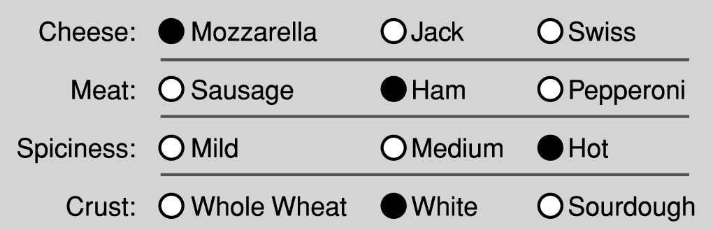
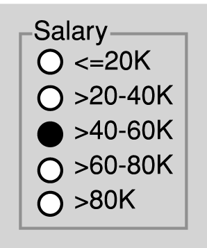
Sometimes individual radiobuttons are so far apart that they don't look like they belong to a single setting
A common form of this blooper is to arrange radiobutton settings one above the other, such that individual choices in each setting are closer to choices in other settings than they are to choices in their own setting
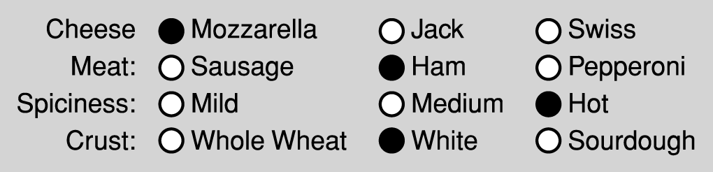
In the picture above the user might be able to figure out that the choices are organized by row, but we could imagine a case in which that would be more difficult (see below)
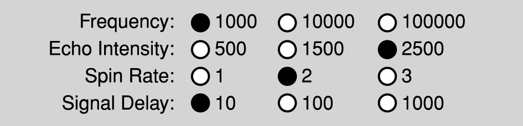
or another example
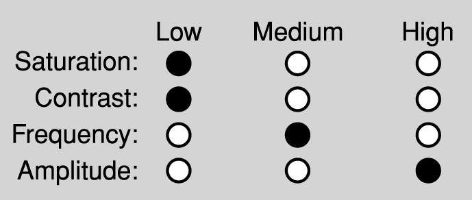
or
March 28, 2005