
Cover
Due date: Monday, March 19th, 11:59pm
Cover
The goal of this project is to get used to part of the game analytics pipeline, applying the pipeline to EA's FIFA 18. You will import data into a spreadsheet program (e.g., Excel), then work to querying, extraction and analysis the data. Analysis includes creating a report with charts and tables, and possible dissemination by presentation. The tool pipeline will be used for subsequent projects, including a more advanced analysis of game data.
Setup an environment for FIFA 18 game analytics.
At this point, the primary installation is of a spreadsheet. Choose the installation method appropriate for your Operating System and install a spreadsheet:
https://it.wpi.edu/Article/Install-Microsoft-Office-2016-on-Windows
sudo apt-get install libreoffice
We will be using:
Aman Shrivastava. "FIFA 18 Complete Player Dataset", Kaggle Dataset, Last updated: December 2017.
The dataset is from the latest edition (2018) of EA FIFA, with 17k+ players having more than 70+ attributes. The data itself is scraped from SoFIFA, which itself grabs data from the PC version of FIFA 18 as it is updated, and uploads it to the Web.
I have downloaded the relevant Kaggle dataset here:
If you prefer, you can download the Shrivastava data from the source:
https://www.kaggle.com/thec03u5/fifa-18-demo-player-dataset/data
If so, you will need a Kaggle account/login and will want to make sure to only grab the file:
CompleteDataset.csv
Once the data is downloaded, check that you can successfully open it with your spreadsheet. You should see something like:

with attributes in the columns and one player per row.
When done, proceed to part 1.
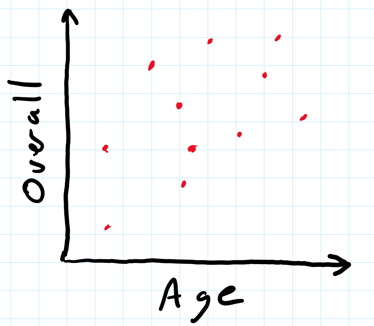
Analyze Overall Rating versus Age. This analysis must be in the form of a scatter plot chart, something like:
To draw the chart, use a spreadsheet (e.g., Microsoft Excel). The scatter plot chart (and many charts), needs to have the data in two columns. Something like:
Rating,   Age,
90,        22,
89,        25,
88,        26,
....
Note, the raw data has each column separated by a comma. This file format is known as "csv" for "comma separated values" and can be read into most spreadsheets.
Fortunately, the original dataset is already in the right format! You just need to select the two relevant columns, and then create/insert a chart from the data.
For help with selecting columns:
There are lots of online resources for making spreadsheet charts. One such is:
For the above link and all below, if your version of Excel or spreadsheet does not match the tutorial, hit F1 for "Help" and then type your query (e.g., "create a scatter plot").
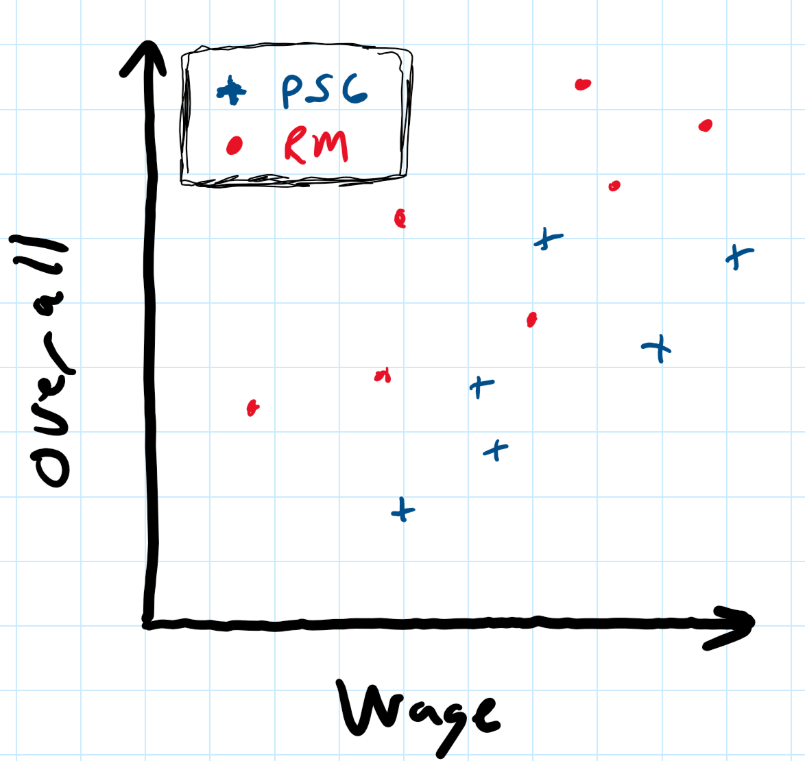
Analyze Overall Rating versus Wage (per week) for two club teams, Real Madrid and Paris Saint-Germain. This analysis must be in the form of a scatter plot chart, but with the two teams clearly differentiated. Something like:
Once done compute and report (in table form):
Note, the wage values in the dataset are already per week - no need to adjust further.
In order to do the intended analysis, it is helpful to cluster players from the same teams together. One way to do this is to sort by a particular column (e.g., Club):
Then, you can select just some of the rows (e.g., only the rows with Real Madrid players). Steps on selecting a set rows can be found here:
Computing averages in spreadsheets is typically done with a built-in function. In Excel:
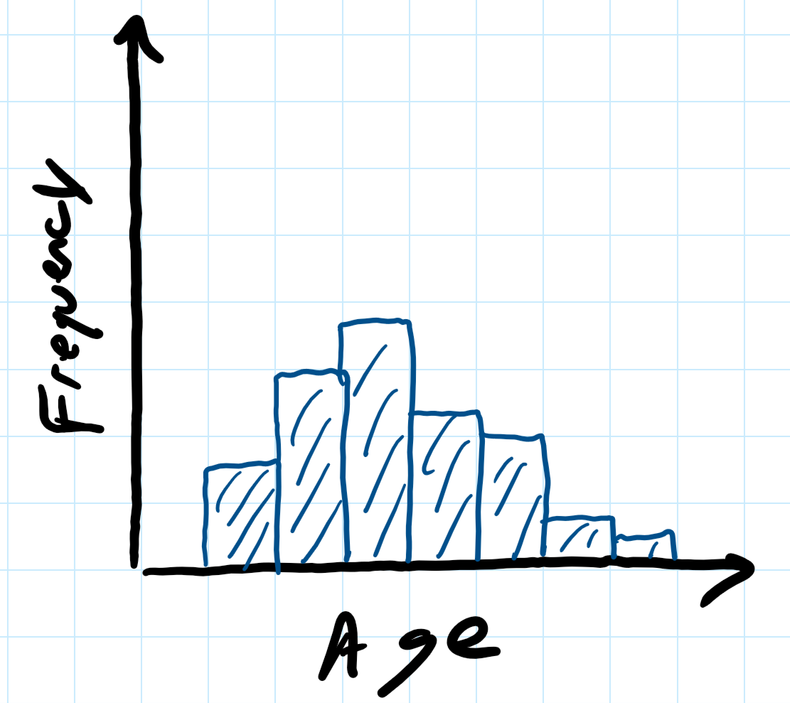
Analyze the age of all players. This analysis must be in the form of a histogram (bucket size is optional), something like:
Tips for drawing a histogram with Microsoft Excel can be found at:
As for other tips, if your version of Excel does not match the tutorial, hit F1 for "Help" and then search for "Create a histogram".
Analyze average Speed according to Preferred Position for all players. This analysis must be in the form of a bar chart. Something like:
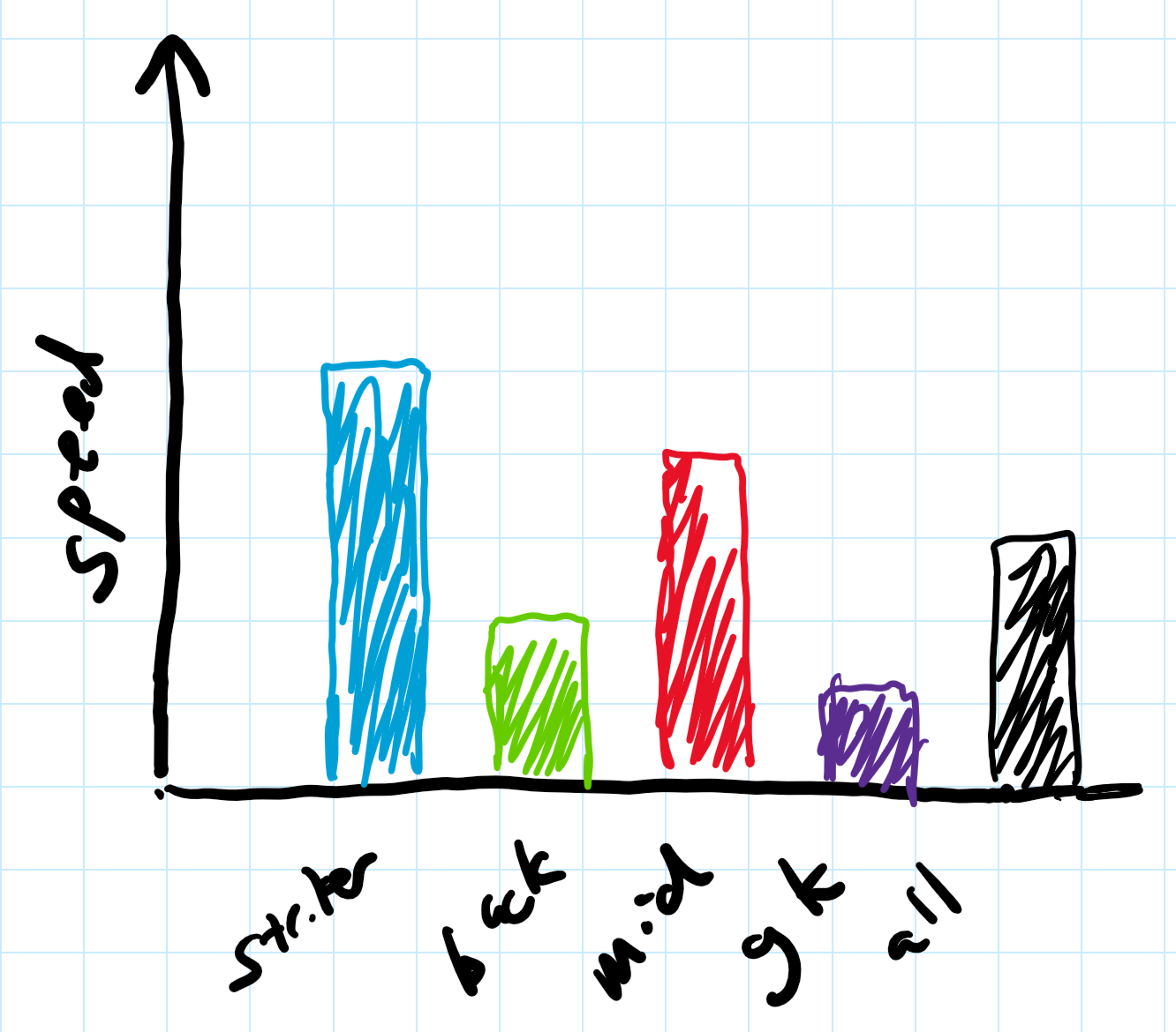
Only the positions of striker (ST), center midfield (CM), center back (CB), goal keeper (GK) and overall (averaged over all players in the dataset) need to be analyzed.
Note, the speed attribute is labeled sprint_speed in the dataset.
Also note, some speed values have a "+" associated with them. e.g., "95+2". You can either ignore those players, add the values (e.g., treat that as a "97") or use only the base (treat that as a "95"). Making these types of decisions is often part of data cleaning! Whatever you choose, you should note it clearly in your report.
As for other charts, the trick is to get only the rows with the position desired selected. One way to do this is with filters, filtering in data that matches a pattern (e.g., GK) and filtering out data that does not:
Note, you can take filtered data and copy it, say, to another spreadsheet for analysis.
Pick another, as of yet analyzed aspect of the FIFA 18 dataset (not a new dataset) of interest to you and analyze it. This could include new, un-analyzed Player attributes (e.g., skill) or un-analyzed team/club comparisons (e.g., MLS to La Liga). Feel free to be creative!
This must include a chart and may include a table or other statistics.
Writeup a short report on the above analysis. Include a brief description of the methodology, particularly as it may relate to the results obtained. Have clearly labeled sections for each Part (e.g., Section 1). You do not need to include Part 0 - Setup in your report.
All results in the form of charts and tables should:
For reference, consider a good example of descriptive text to accompany a chart made through data analysis.
Remember, the independent variable on the x-axis (horizontal axis) and the dependent variable on the y-axis (vertical axis). The independent variable is the one that you manipulate, and the dependent variable is the one that you observe. Note that sometimes you do not really manipulate either variable, you observe them both. In that case, if you are testing the hypothesis that changes in one variable cause (or at least correlate with) changes in the other. Put the variable that you think causes the changes on the x-axis.
The comments below are common mistakes from previous years. They may pertain to your project. They are not provided in any particular order.
Number all pages.
Sections should be numbered and with a name/label (e.g., "Section 1. Matches" instead of "Section 1.").
Using color to differentiate points (and lines) is ok (even good), but they should also be distinguishable in black and white. Black and white is still the lowest common denominator - some people are color blind, many printers don't do color and even some devices do not Differentiate with thickness and/or hashes and/or point types.
Excel provides horizontal lines and grids on charts by default. These are almost always not needed and provide unnecessary "ink", clouding the message.
Excel may choose axis marks that make little sense (e.g., 1, 7, 13 ...). Control the axis marks to provide something that is meaningful given the data.
If a chart has a single data series, a key/legend is not needed.
Figures are numbered differently than tables (e.g., Figure 1, Figure 2 and then Table 1 and Table 2). Also, use capitalization for each.
Histograms should not have spaces between the bars (or only small spaces). Also, a bar with one number below it (e.g., 25) is not clear - does it represent, e.g., 20-25 or 22.5 - 27.5?
Think about font size when placing a chart in a paper. In general, the font size of the embedded figure should be comparable to the paper itself.
Make sure to submit PDFs only. Word docs or other formats are not acceptable.
Write formally. Avoid conversational prose (e.g., "it was insanely large") and hyperbole. Similarly, do not use contractions (e.g., "don't" instead use "do not") and do not use second person (e.g., "you", "your", and especially "y'all").
Check the number of significant digits on a computation. Just because Excel can provide a standard deviation of 7.8215132511 does not mean all digits should be reported. First, are they really significant or are they within the error of measurement (e.g., for time which is measured in seconds)? Second, does it really help the reader? e.g., better would be 7.82 or even 7.8.
If embedding a picture taken from a screen shot, be sure to choose a high resolution monitor, blow the picture up as large as possible and then take the screen capture. This will minimize the chance of it looking blurry in the document.
The FIFA 18 home page.
The kaggle dataset for this project.
The original source for the kaggle dataset.
A FIFA 18 Data Visualizer you might try to examine various relationships.
The assignment is to be submitted electronically via the Instruct Assist Website by 11:59pm on the day due.
The submission is a report in PDF, named:
proj1-lastname.pdfwith your name in place of "lastname" above, of course.
To submit your assignment, log into the Instruct Assist website:
Use your WPI username and password for access. Visit:
Tools → File Submission
Select "Project 1" from the dropdown and then "Browse" and select the assignment file (i.e., proj1-lastname.pdf).
Make sure to hit "Upload File" after selecting it!
If successful, there should be a line similar to:
Creator    Upload Time             File Name        Size    Status   Removal
Claypool 2018-03-12 21:40:07 proj1-claypool.pdf 3208 KB On Time DeleteAll accomplishments are shown through the report. The point break down does not necessarily reflect effort or time on task. Rather, the scale is graduated to provide for increasingly more effort required for the same reward (points).
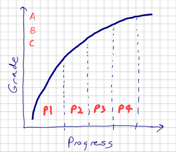
Part 1 - 30% : The analysis of rating versus age represents a large chunk of the grade. Completing this part means a basic tool pipeline is setup and can be used, with a basic demonstration of one full-set of analysis.
Part 2 - 25% : The analysis of rating versus wage is worth an additional chunk of the grade. Completing this demonstrates more sophisticated queries and analysis.
Part 3 - 20% : The analysis of age is worth an additional chunk of data. Completing this demonstrates an additional chart and analysis skill.
Part 4 - 15% : Comparing speed by position is worth an additional letter grade worth of points. Doing so reinforces the skills already demonstrated one time.
Part 5 - 10% : Analyzing data of choice is worth a small fraction of the grade as it represents the "icing on the cake". It shows an additional set of queries as well as new insights that are self-driven.
100-90. The submission clearly exceeds requirements. All parts of the project have been completed or nearly completed. The report is clearly organized and well-written, charts and tables are clearly labeled and described and messages provided about each part of the analysis.
89-80. The submission meets requirements. The first 3 parts of the project have been completed well, but not parts 4 or 5. The report is organized and well-written, charts and tables are labeled and described and messages provided about most of the analysis.79-70. The submission barely meets requirements. The first 2 parts of the project have been completed or nearly completed, but not parts 3 or 4. The report is semi-organized and semi-well-written, charts and tables are somewhat labeled and described, but parts may be missing. Messages are not always clearly provided for the analysis.
69-60. The project fails to meet requirements in some places. The first part of the project has been completed or nearly completed, and maybe some of part 2, but not parts 3, 4 or 5. The report is not well-organized nor well-written, charts and tables are not labeled or may be missing. Messages are not always provided for the analysis.
59-0. The project does not meet requirements. No part of the project has been completed. The report is not well-organized nor well-written, charts and tables are not labeled and/or are missing. Messages are not consistently provided for the analysis.
The comments below are in response to graded projects. They are not provided in any particular order.
 Return to the IMGD 2905 home page
Questions: imgd2905 question-answer forum