Blooper 25: Inconsistent Separator Style
Images from GUI Bloopers, by Jeff Johnson. Used without permission.
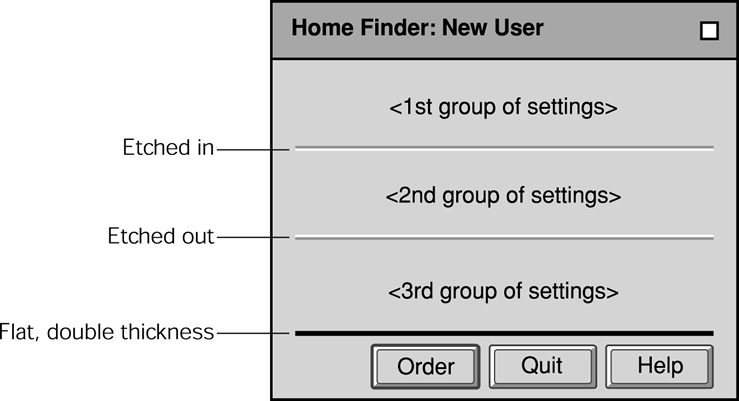
What's wrong with these?
- Assigning different styles to to separators in different parts of the application.
- The first separator is etched in and the second etched out.
- The third separator has a different width with no difference in meaning for the thickness
Design Rule: Avoiding this blooper
Separators in an application or family of applications should all have the same line style. The most common and recommended style for separators is etched in.
Also use the thinnest possible line width, to keep the separators looking light and unobtrusive.
Whatever separator line style you choose, it is important to use it consistently throughout the application or family of applications.
If the GUI toolkit you are using doesn't have etched separators and the style guide for the target platforms requires them, you will need to construct them using adjacent simple lines. Ideally, separators should not consist of one black line and one white line. Rather, they should consist of of one line that is darker variation of the background color (whatever that is) and one white line. This makes for a separator that looks more like an etched-in (or etched-out) feature of the background surface.
Since most backgrounds in a product line or family of applications are the same color (e.g., gray or beige), optimizing separators for the background is not difficult.