Due date: March 24th, 2002
You are to conduct experiments to evaluate the performance of your audioconference (Speak) from Project 2. The focus of this project is mainly not on how well your software works, but rather the scientific evaluation of the audioconference quality under a wide-range of system conditions. Of importance is the the design, implementation and analysis of your experiments to evaluate the performance of your audioconference.
There are two parts to evaluation of your audioconference. The first involves an in-depth user study amongst your group. The second involves a briefer user study outside your group.
For both parts, the primary means you will evaluate your software is by user perception. You should record user opinions on a scale of 1-100, based on a 1-2 minute conversation. You are free to use whatever means you think appropriate to gather user numerical opinions and you can gather additional user comments or feedback, also, if you wish.
You will manipulate an independent variable and determine its impact on user perception of your audioconference. The cases you should specifically examine above your default audioconference (individually, not in combination) are:
You will evaluate your audioconference by running a simple user study with people outside your group.
You must provide details on both the results and the analysis. The results are the numeric measures recorded in the experiments, in the form of graphs, charts or tables. The analysis involves manipulating the data to understand relationships and interpreting the results. The analysis should consider details on the overall effectiveness of your audioconference.
The main deliverable for this project is a report describing:
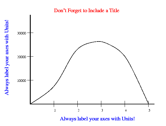
Visualizations, such as graphs or charts, even simple ones, are typically much better representations of data than just tables of numbers. All graphs should include:

A title which summarizes what the graph is showing. The title can be at the top of the graph or in the caption below the figures
The independent variable on the x-axis (horizontal axis) and the dependent variable on the y-axis (vertical axis). The independent variable is the one that you manipulate, and the dependent variable is the one that you observe. Note that sometimes you don't really manipulate either variable, you observe them both. In that case, if you are testing the hypothesis that changes in one variable cause changes in the other, put the variable that you think causes the changes on the x-axis.
Labels on the x-axis and the y-axis. Where appropriate, these labels must include the units of measurement. Examples include "arm length, in cm," "time, in generations," and "number of head bumps per week."
Numbers on the x-axis and the y-axis. These should be evenly spaced numbers, such as 0.4, 0.5, 0.6, 0.7.... If the numbers on your x-axis aren't evenly spaced (for example, they go 0.45, 0.5, 0.6, 0.62, 0.63) it means you chose the wrong kind of graph. When there are more than one set of points, they should be labeled (in the form of a legend or key or next to each line). If you only have one set of points, do not include a legend.
If you are using Windows, MS Excel has good support for drawing graphs. You might try this tutorial http://www.urban.uiuc.edu/Courses/varkki/msexcel/graphs/Default.html to get started.
If you are using Unix, gnuplot has good support for drawing graphs. You might see http://www.gnuplot.info/ for more information.
You might look at the slides for this project (ppt, pdf) and the slides for Experiments in computer science (ppt, pdf).
You must turn in a hard-copy of your project report. Please include a title page with a title, abstract and group members. Unless otherwise specified, the hard-copy must be given to me, or delivered to FL138 on the day it is due.
 Return
to the Multimedia Networking Home Page
Send all project questions to the TA mailing list: cs525z_ta@cs.wpi.edu.